Football jerseys have changed considerably over the past few decades. Improvements in textile printing during the late 1980s and 1990s allowed manufacturers to move beyond solid colours and striped templates, introducing geometric graphics, cultural references, and increasingly complex surface treatments. Many designs were forgotten after a single tournament, while others continued to reappear through retro releases, collector culture, and later reinterpretations. The following five jerseys represent different approaches that helped expand the visual language of football shirts.
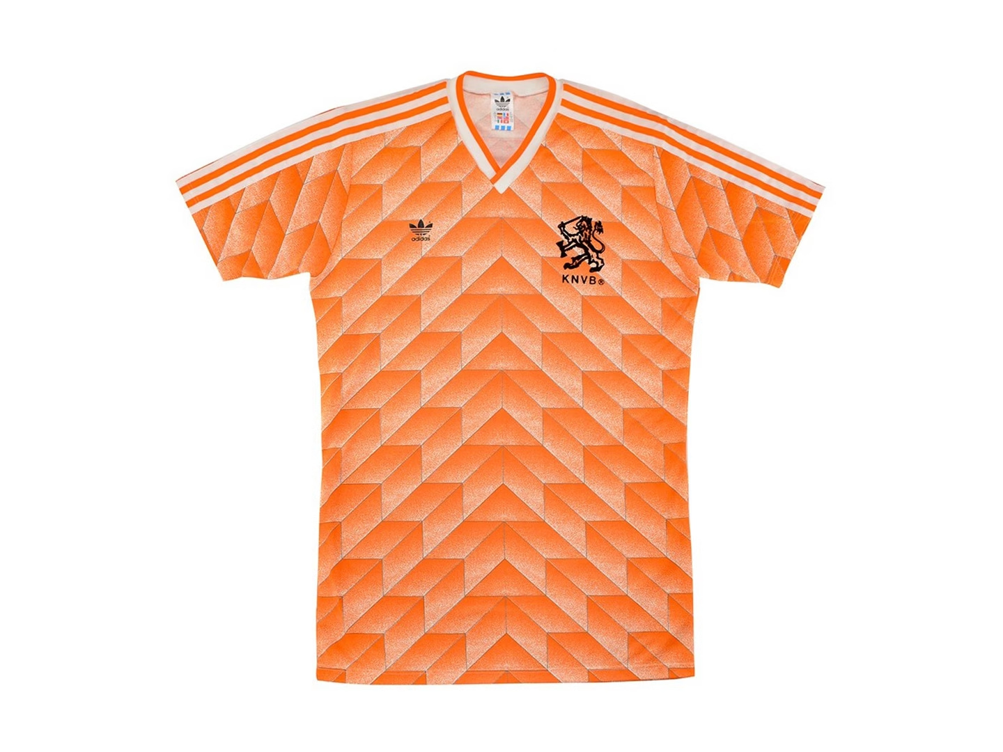
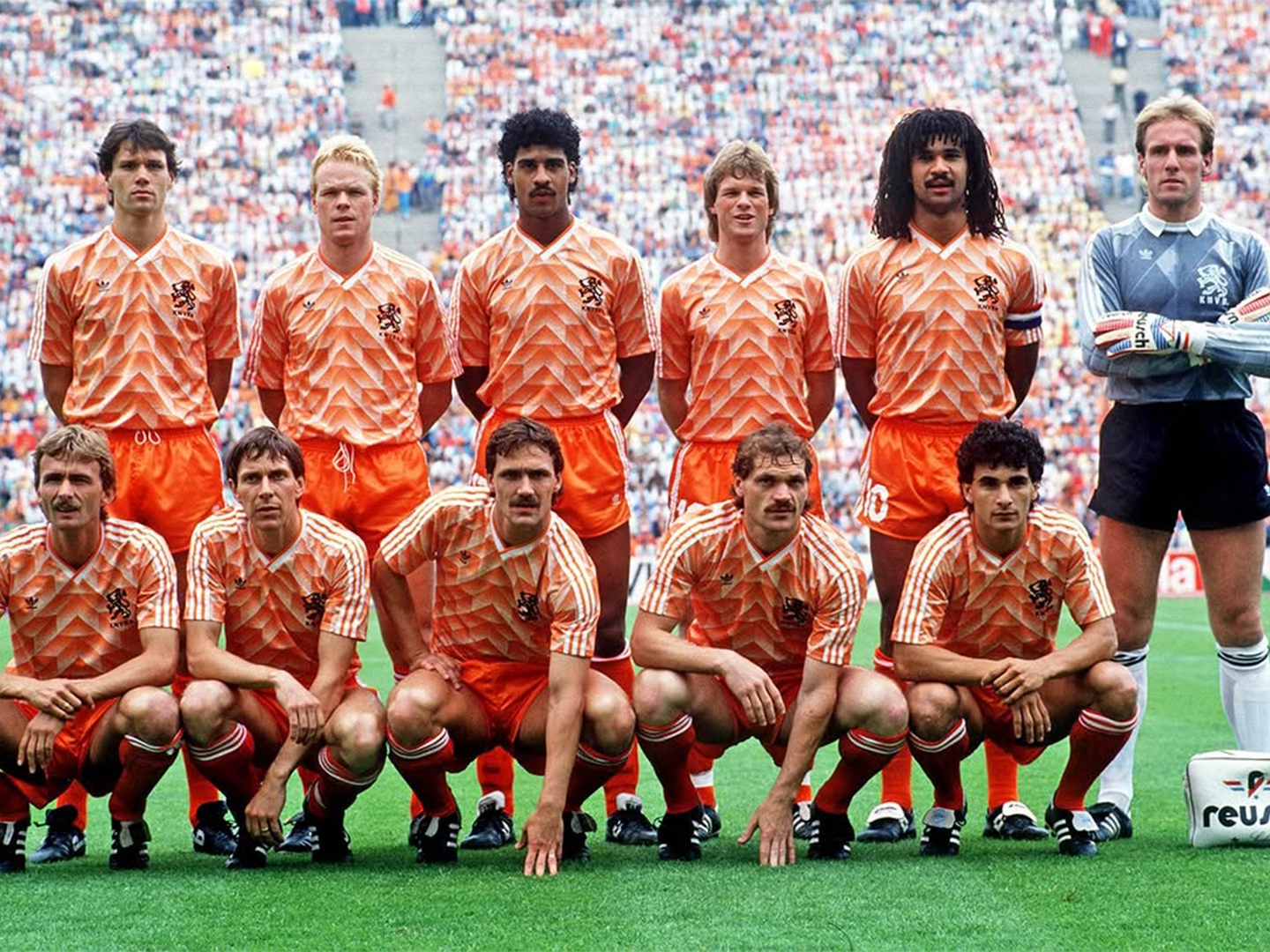
1. Netherlands Home (1988)
Released for UEFA Euro 1988, the Netherlands’ home jersey introduced one of adidas’ most recognizable graphic templates. The bright orange shirt was covered with an interlocking geometric pattern that created depth through tonal variation rather than additional colours. Worn throughout the Netherlands’ European Championship-winning campaign, the shirt has become closely associated with Marco van Basten’s volley in the final. Its geometric treatment marked a noticeable shift from the simpler colour-blocked jerseys that had dominated previous international tournaments and continues to appear in modern reissues and football design retrospectives.
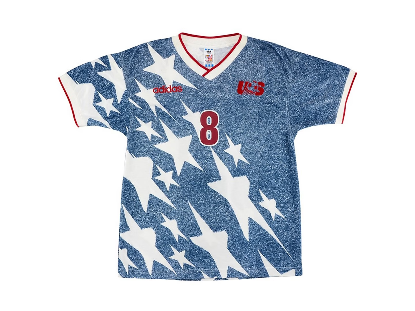
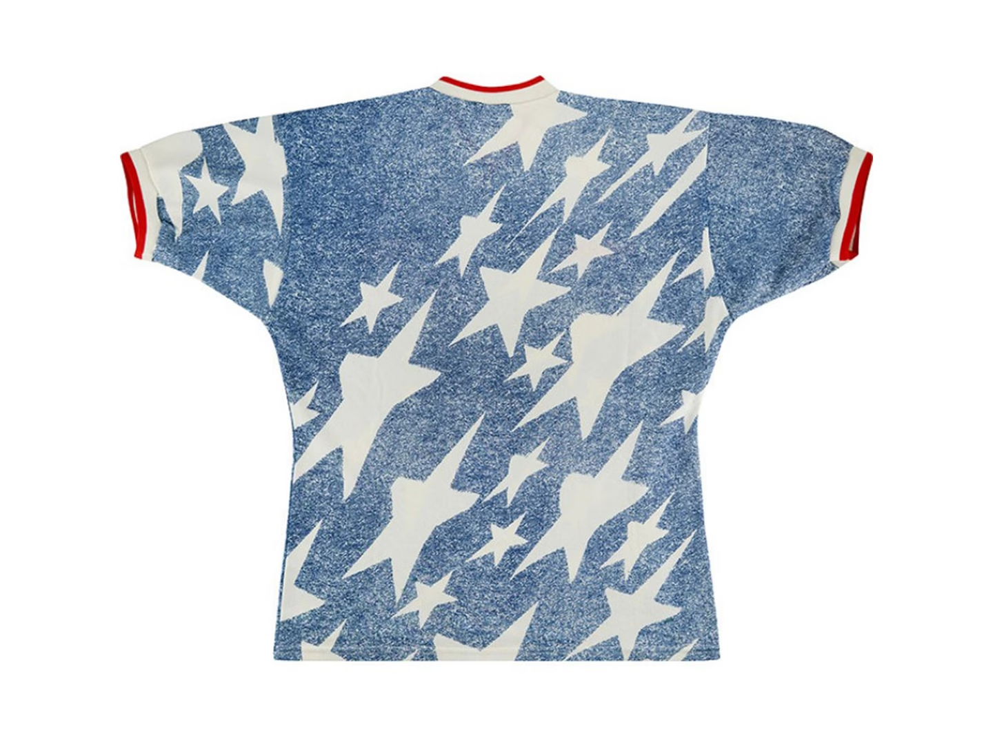
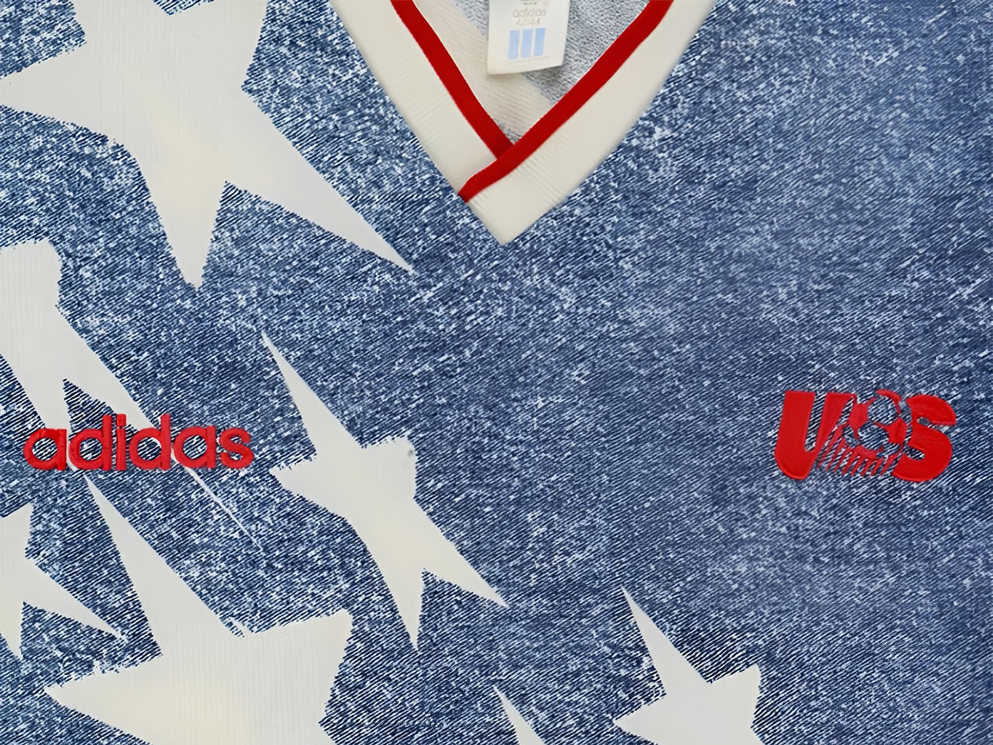
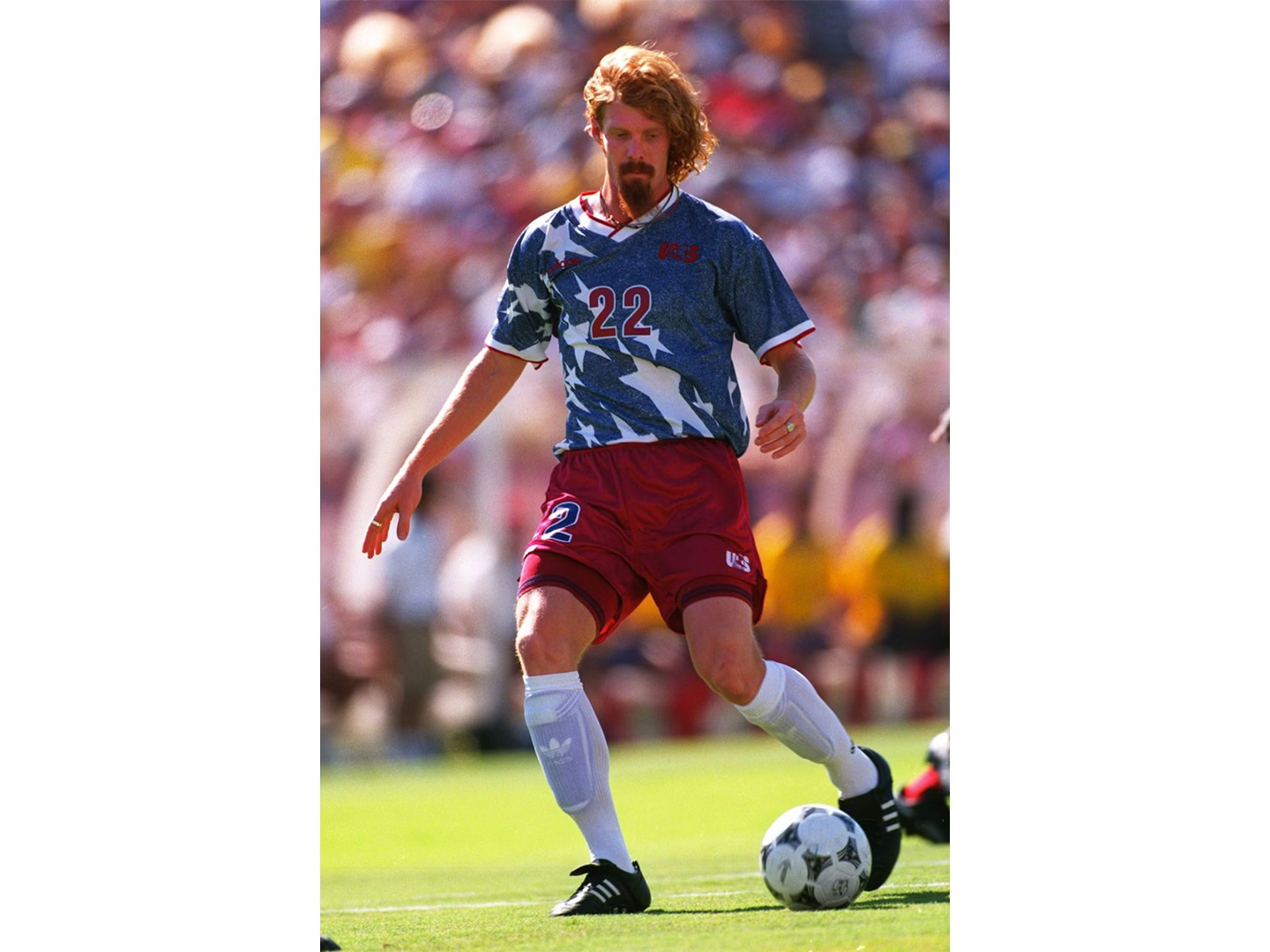
2. USA Away “Denim” (1994)
Hosting the 1994 FIFA World Cup gave the United States an opportunity to present a distinctly American visual identity. Widely credited to designer Peter Moore, the away jersey replaced conventional football graphics with a faux-denim texture interrupted by oversized white stars and finished with red trim. The design divided opinion upon release but gradually developed a strong following among collectors and football shirt enthusiasts. More than thirty years later, adidas revisited the concept ahead of the 2026 World Cup, highlighting how one of the tournament’s most unconventional shirts remained part of American football’s visual identity.
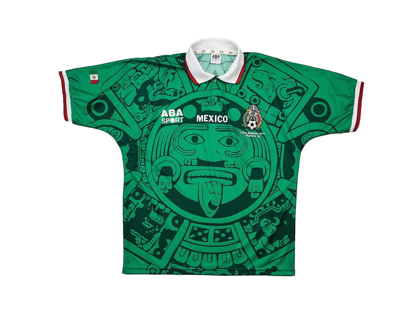

3. Mexico Home “Piedra del Sol” (1998)
Mexico’s 1998 home jersey placed the Piedra del Sol, commonly known as the Aztec Sun Stone, at the centre of the design. Produced by ABA Sport, the face of Tonatiuh stretched across the front of the shirt as a large tonal graphic, accompanied by a white polo collar and restrained red accents. Rather than appearing as a decorative detail, the motif defined the entire composition. The design has remained closely associated with the national team and has been revisited in later Mexico jerseys, including recent interpretations that reference the same Sun Stone imagery.
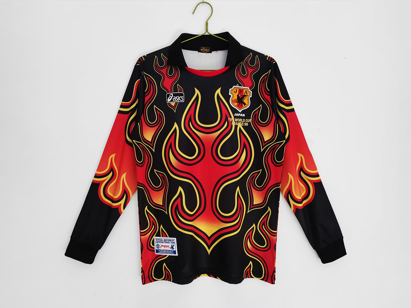
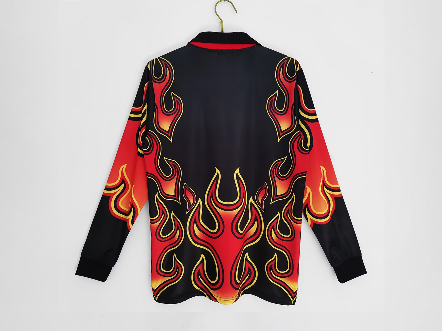
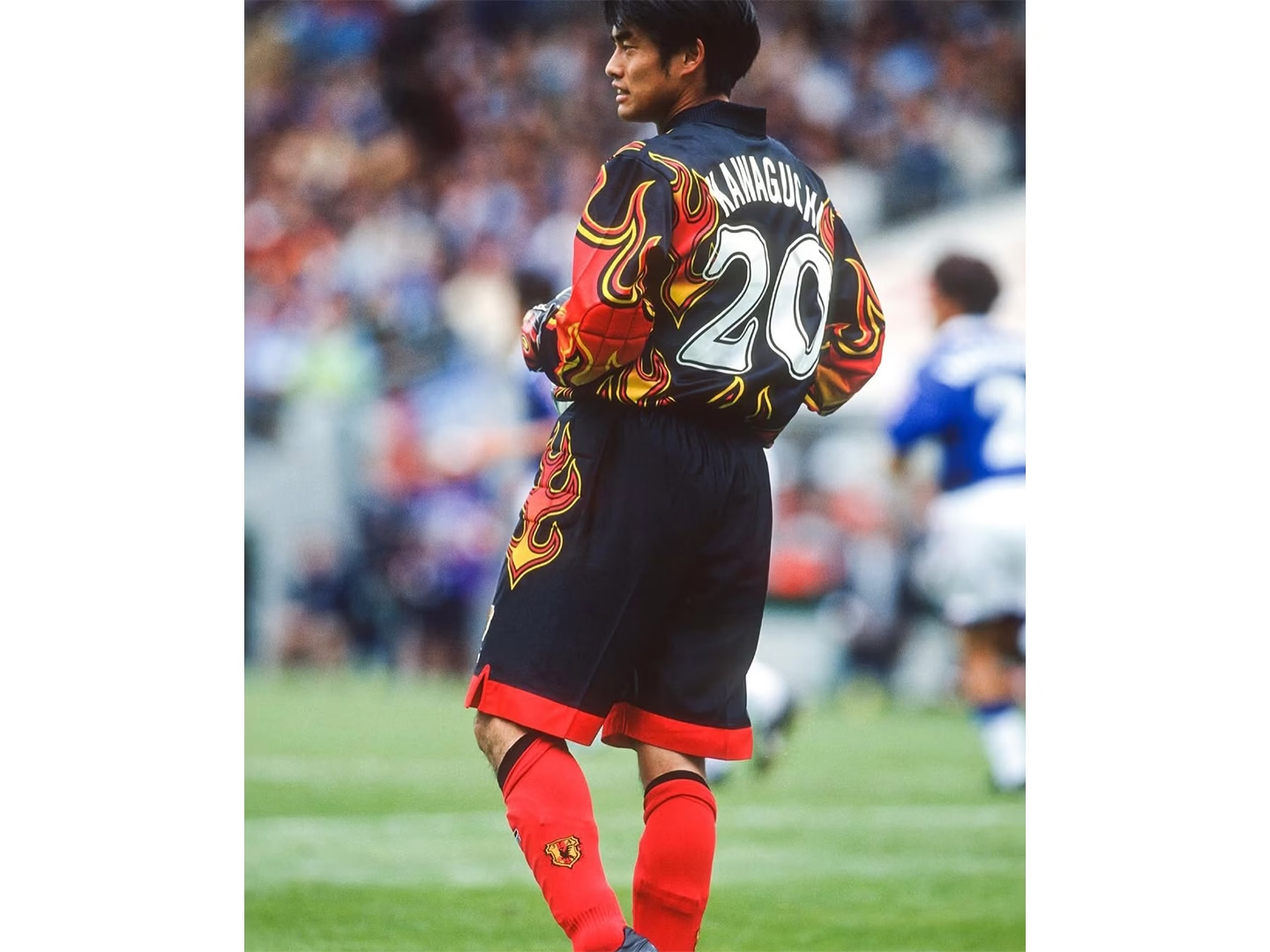
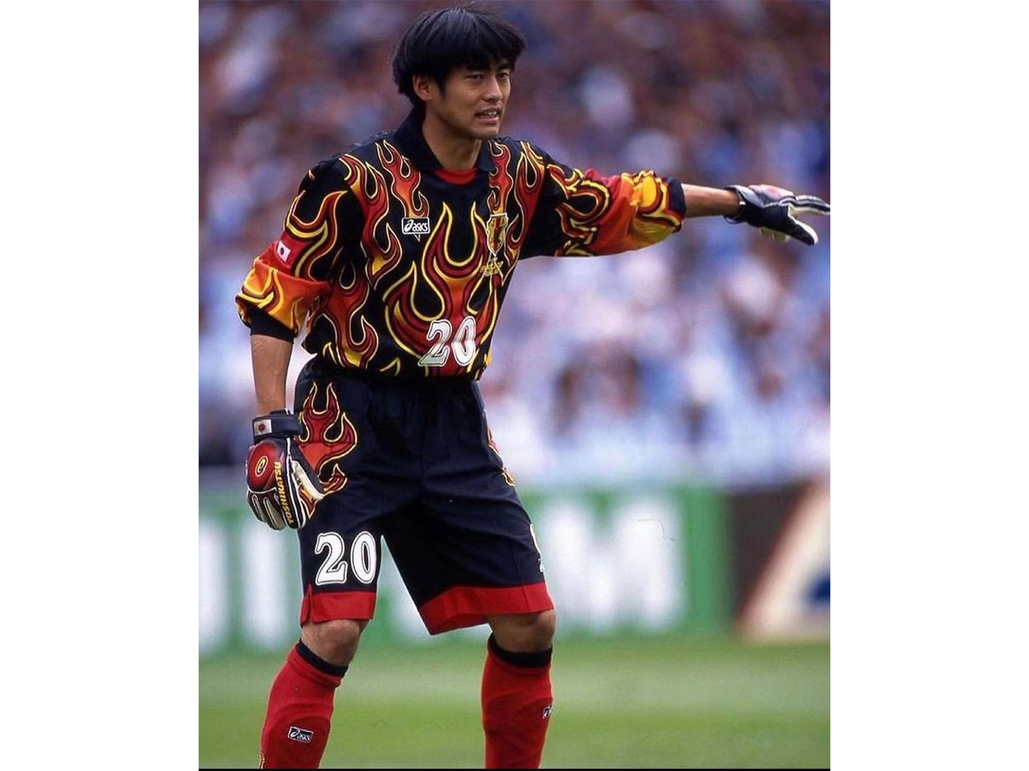
4. Japan Goalkeeper “Flame” (1998)
Japan’s 1998 goalkeeper jersey arrived during the country’s first appearance at the FIFA World Cup finals. Produced by ASICS, the black shirt featured sweeping red, orange, and yellow flames extending across both the torso and sleeves, departing from the geometric patterns commonly found on goalkeeper kits of the period. Japanese kit histories have linked the design to the karura-en fire associated with Fudō Myōō, while outside Japan it became widely recognized simply as the “Flame” jersey. Worn by goalkeeper Yoshikatsu Kawaguchi, the design later resurfaced through commemorative national team releases and fashion collaborations, contributing to its continued presence within football shirt culture.
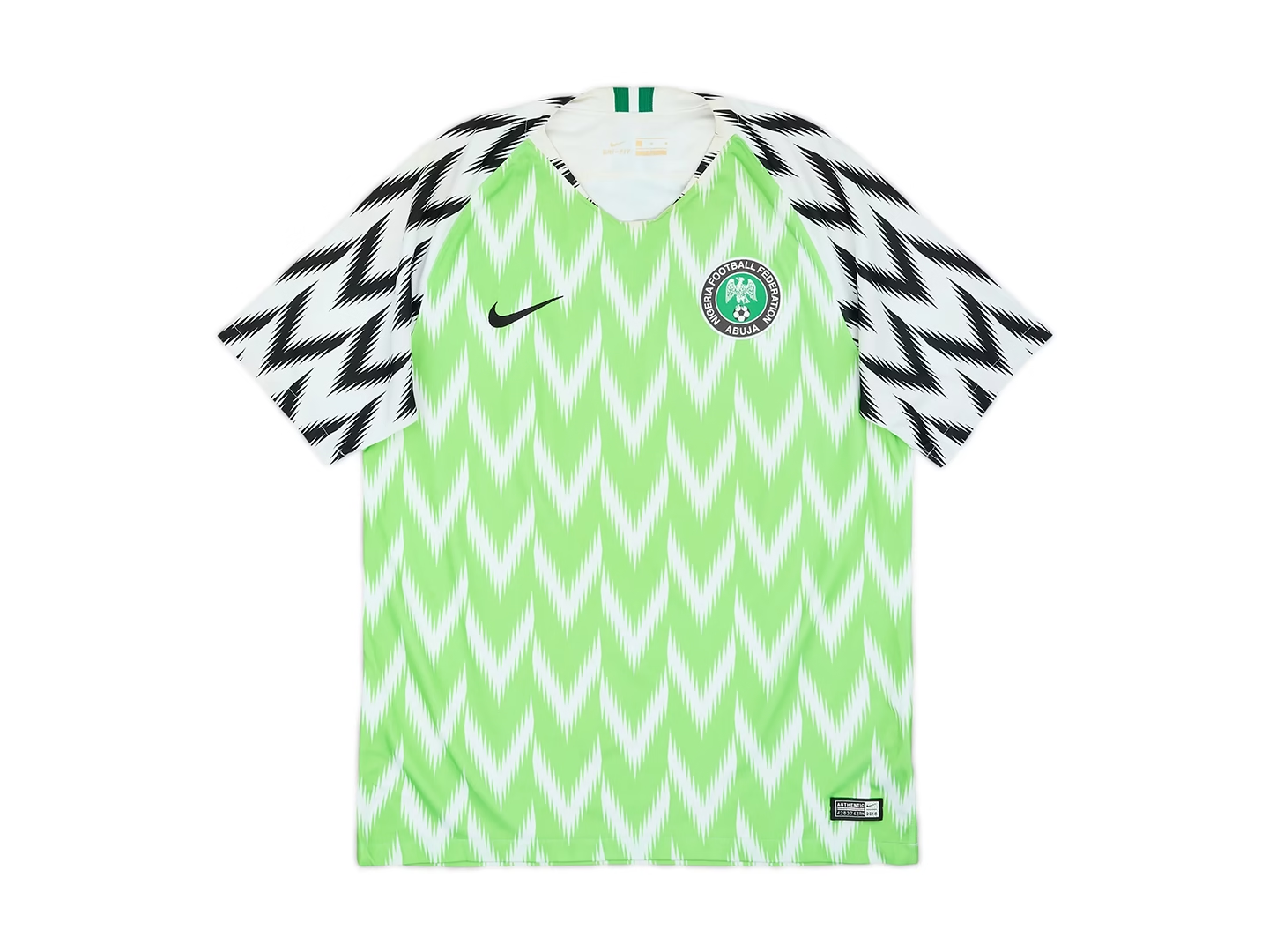
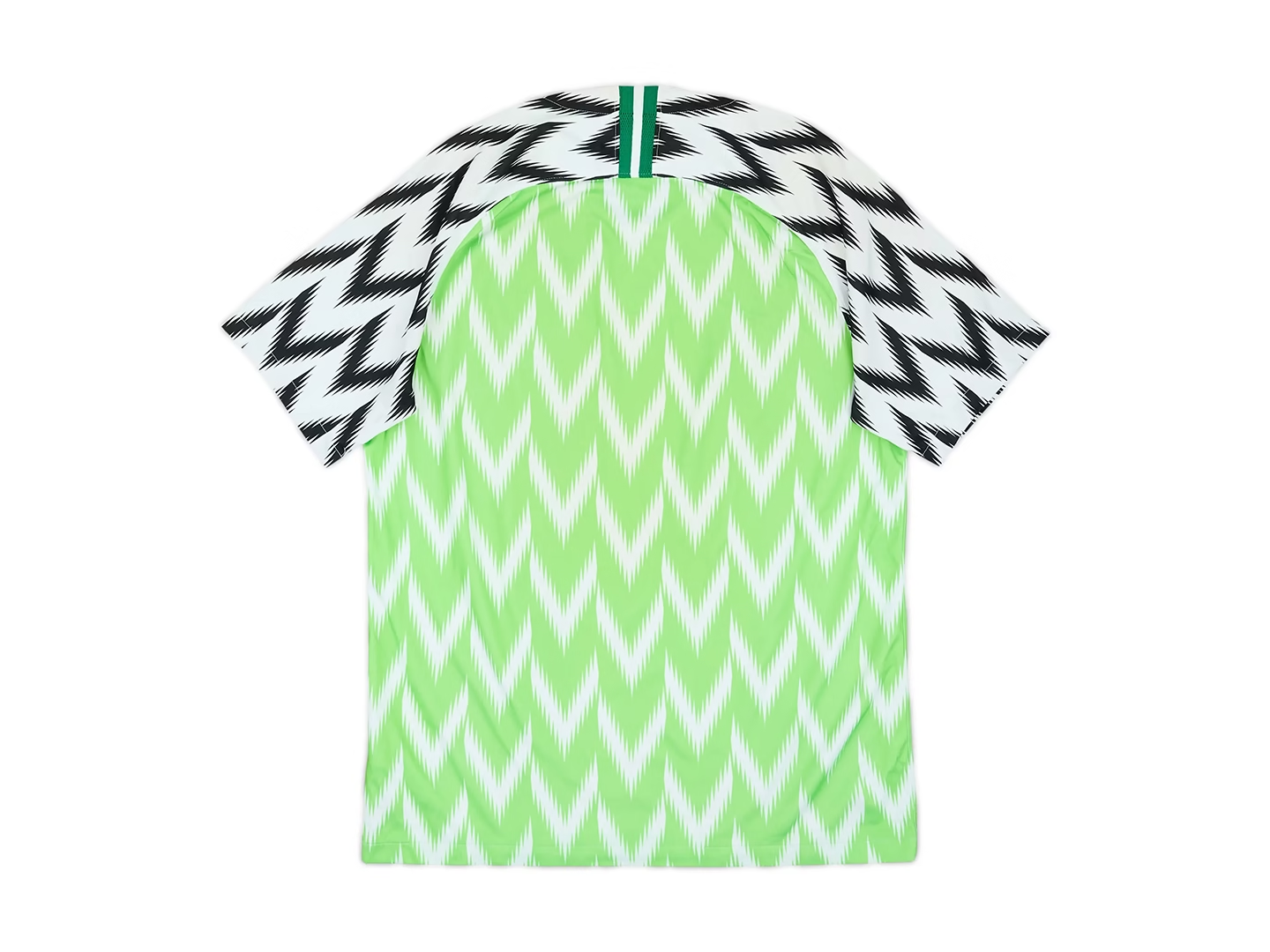

5. Nigeria Home (2018)
Released ahead of the 2018 FIFA World Cup, Nigeria’s home jersey reflected a different approach to football shirt design. Nike’s design team drew from Nigerian art, music, and the country’s 1994 national team kit, combining bright green feather-like chevrons with black-and-white sleeves inspired by the “Super Eagles.” Reports of millions of pre-orders, launch-day queues, and immediate sell-outs placed the shirt well beyond a typical kit release, while its reception demonstrated the growing overlap between football, fashion, and lifestyle products. It remains one of the clearest examples of a national team jersey attracting attention beyond the sport itself.