At Shinjuku Station, one of Tokyo’s busiest transit hubs, a temporary construction sign became an unlikely piece of graphic culture. The lettering was not made by a design studio or transit authority, but by Shuetsu Sato, a security guard who began making directional signs from adhesive tape during renovation work around JR Shinjuku Station in 2004.
The style later became known as Shuetsu-tai, named after Sato himself. Built from tape, careful cuts, and softened forms, it began as a practical way to guide commuters through a confusing station environment. Over time, it moved beyond construction walls, appearing in workshops, media coverage, products, and most recently in the visual identity for Nike Shinjuku.
1. Shinjuku Station Signs
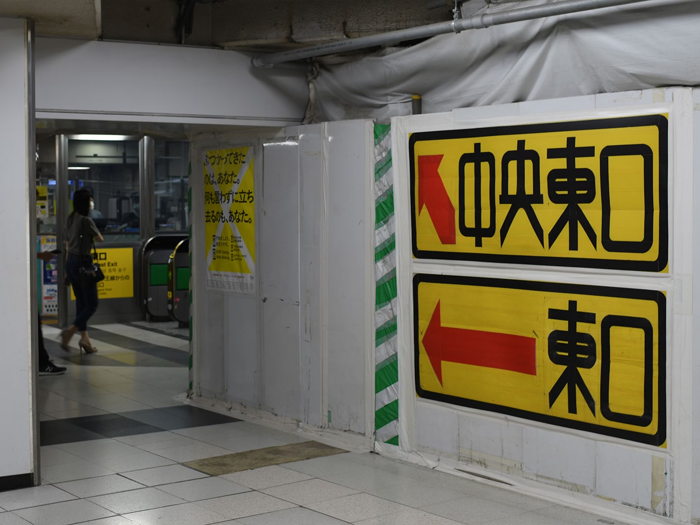
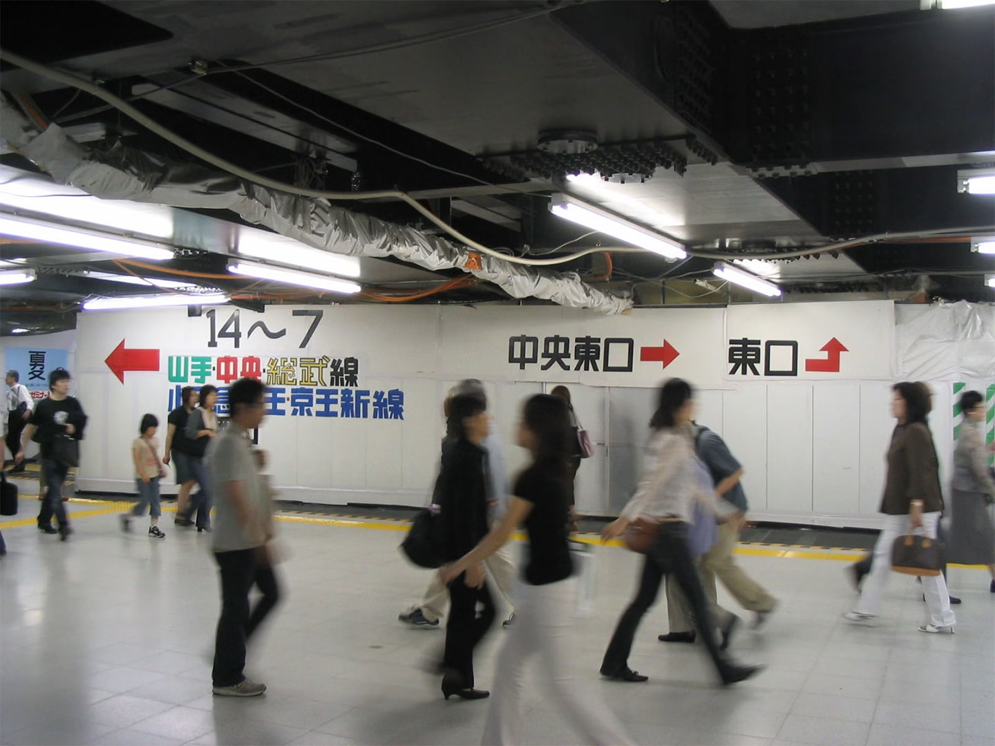
Sato was working for Sanwa Security Services when renovation work around JR Shinjuku Station’s East Exit created a need for clearer guidance. Shinjuku is already difficult to navigate, with multiple rail lines, exits, underground passages, and a constant flow of people. During construction, that complexity became even harder to manage. Using cloth tape from the site, Sato began making large handmade signs for exits, stairs, passageways, and walking routes. They were temporary, but they were also legible, direct, and unusually memorable. Shuetsu-tai did not begin as branding or decoration. It came from a specific pressure inside a public space, where lettering had to be seen quickly, understood by many people, and installed in a changing environment.
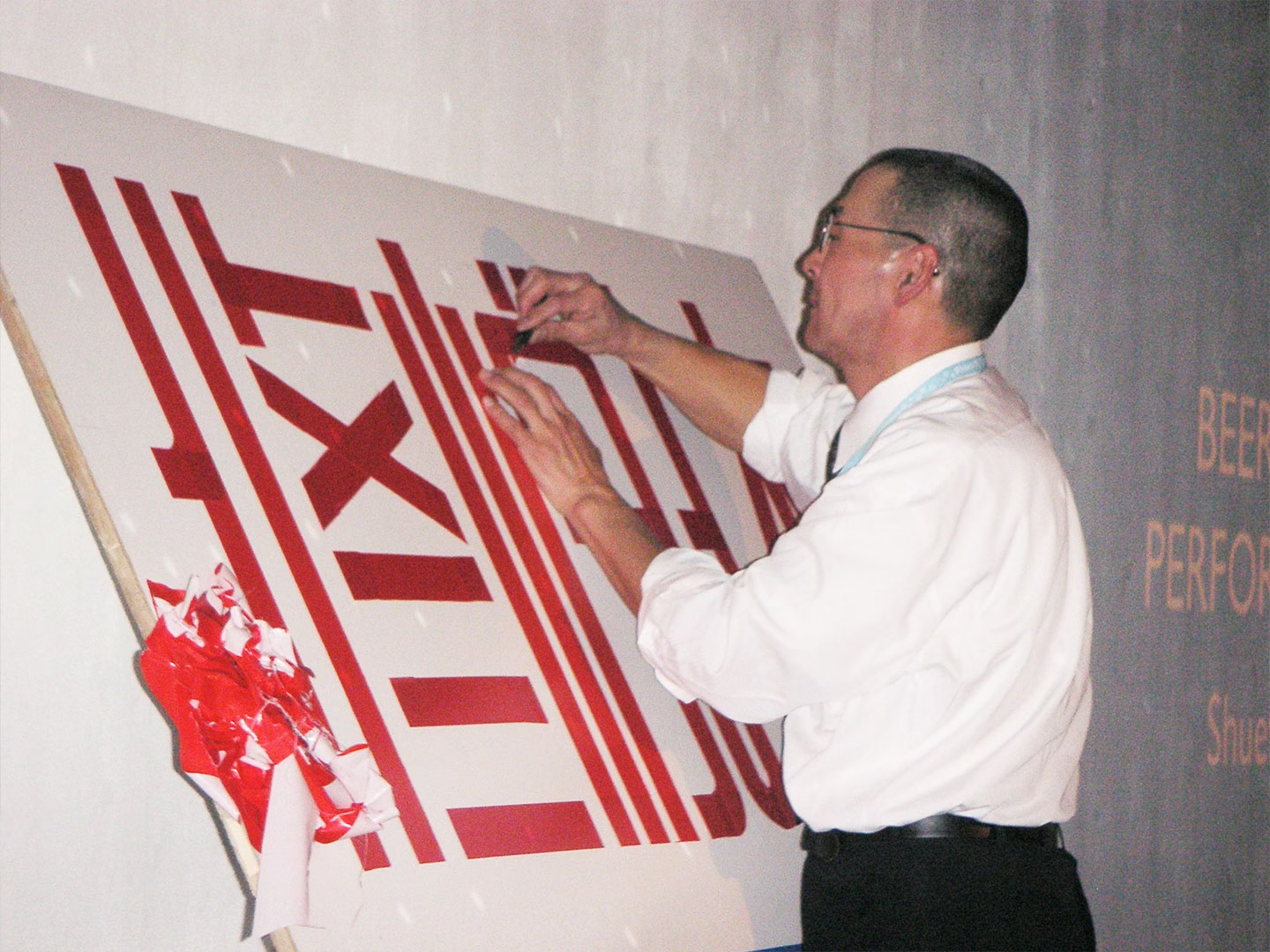
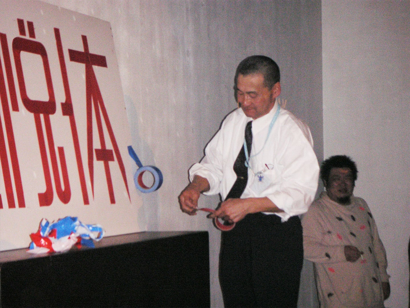
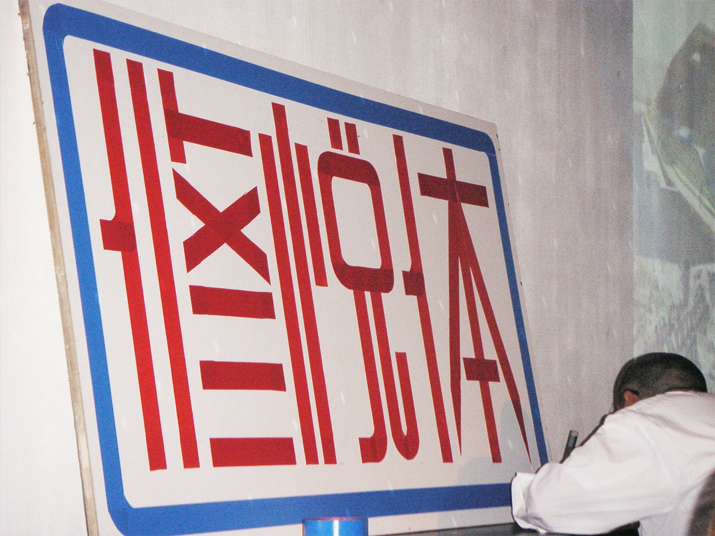
2. Duct Tape as a Design Tool
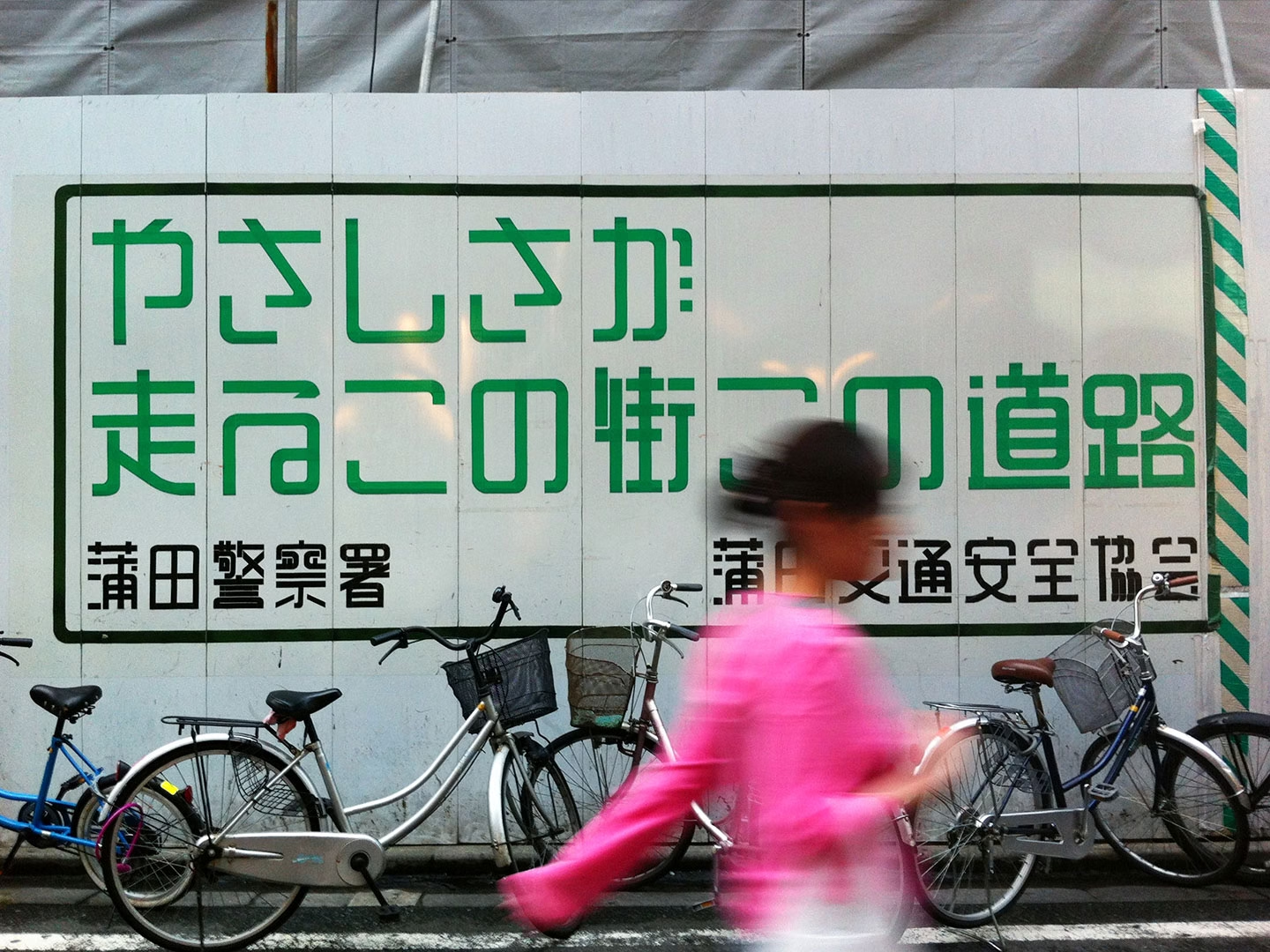
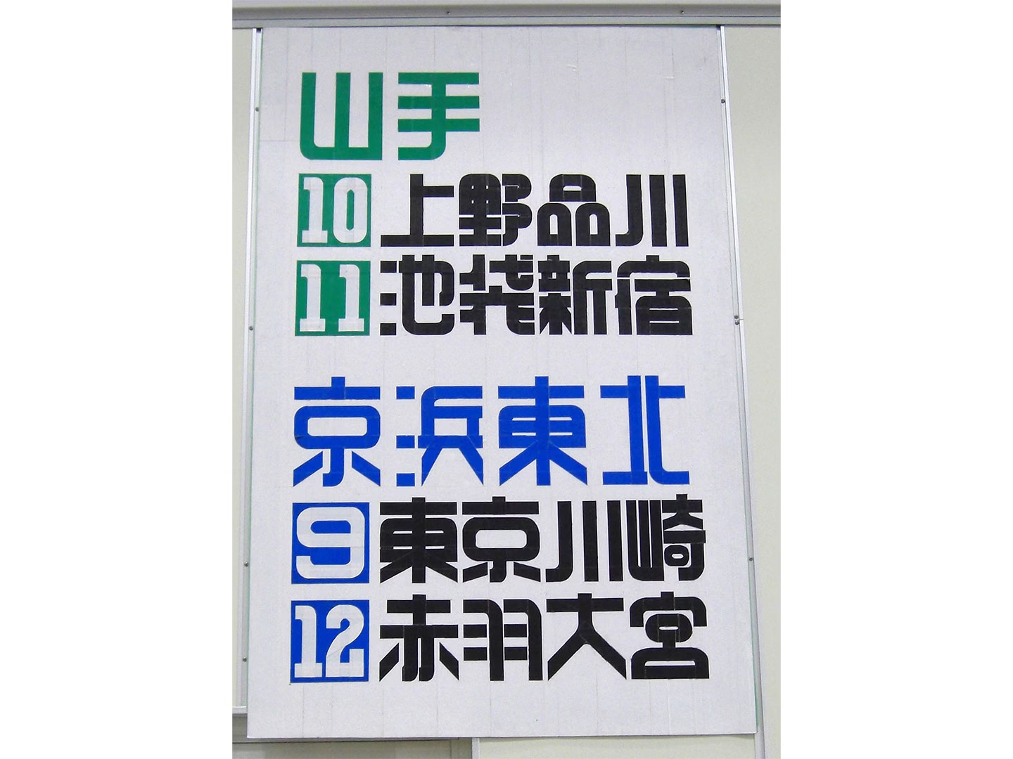
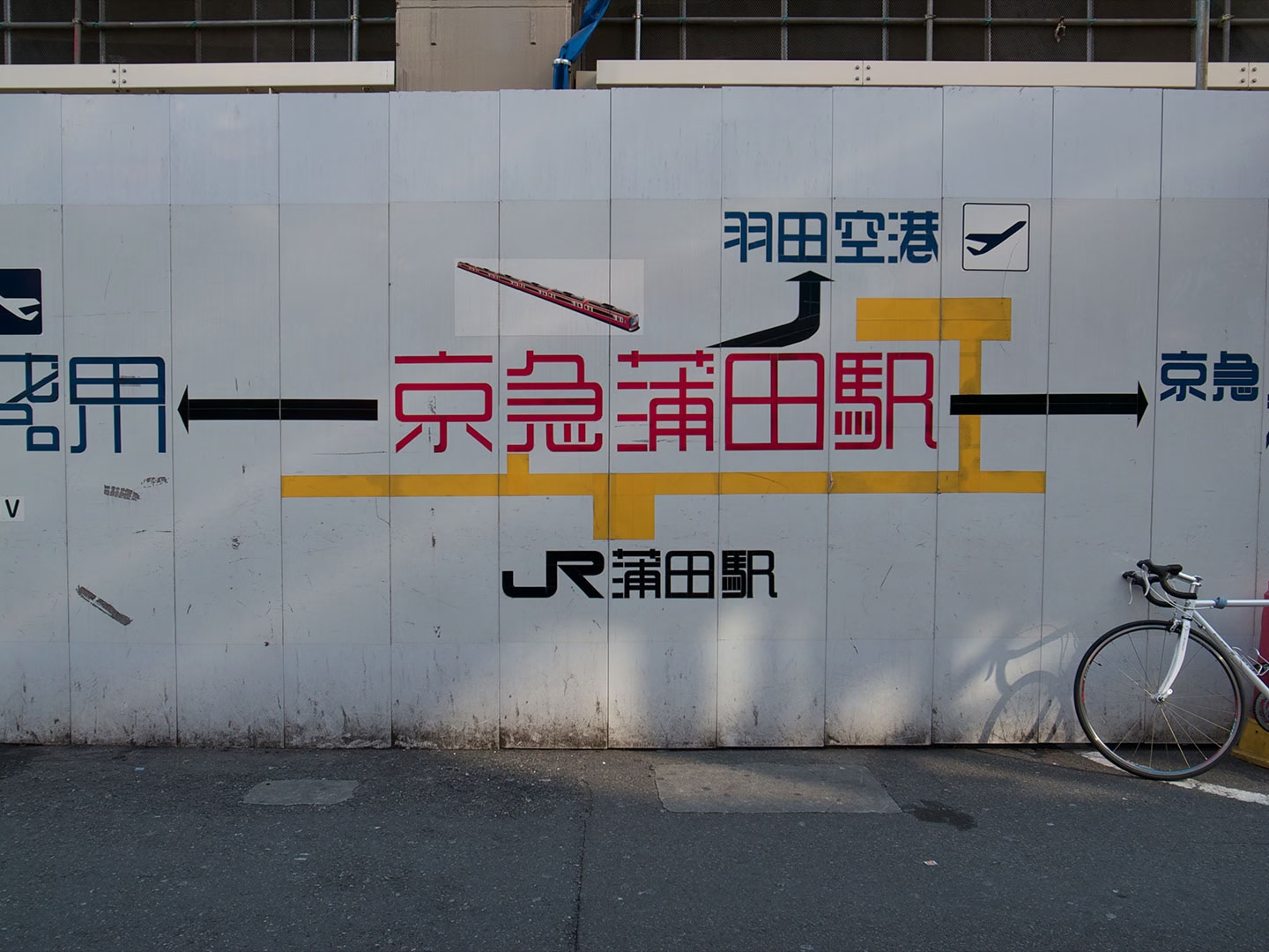
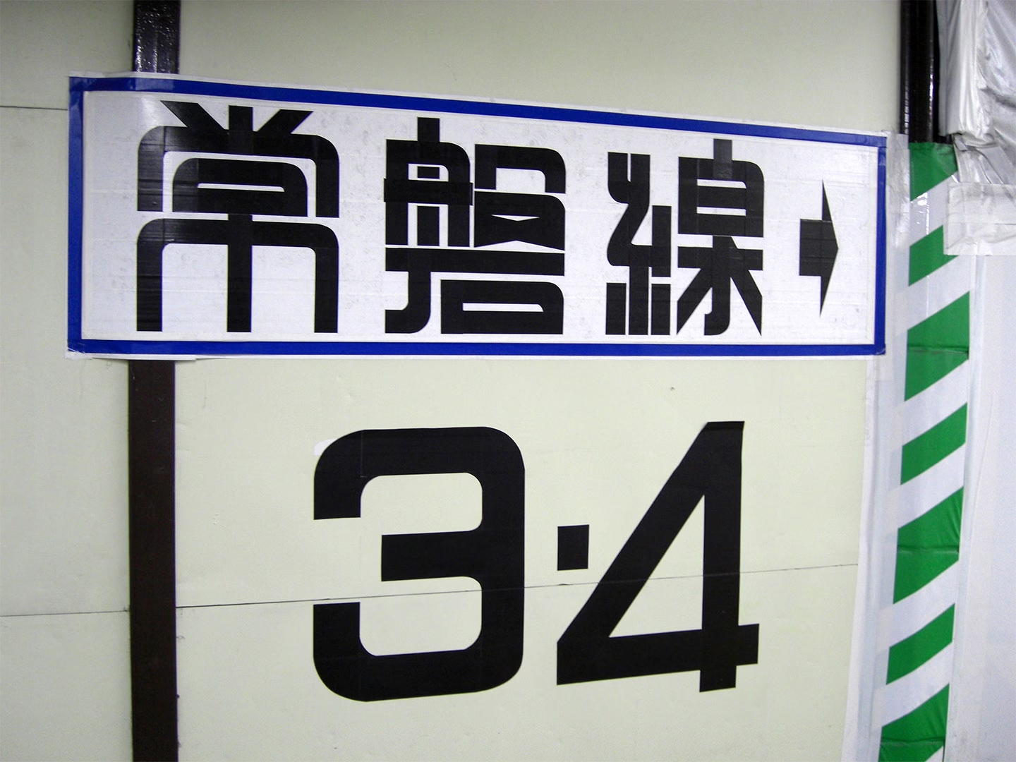
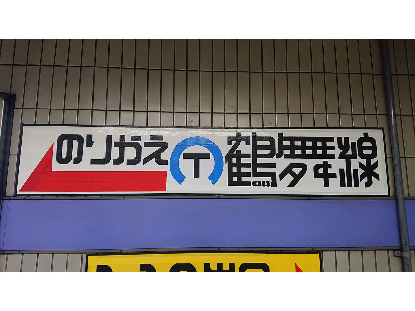
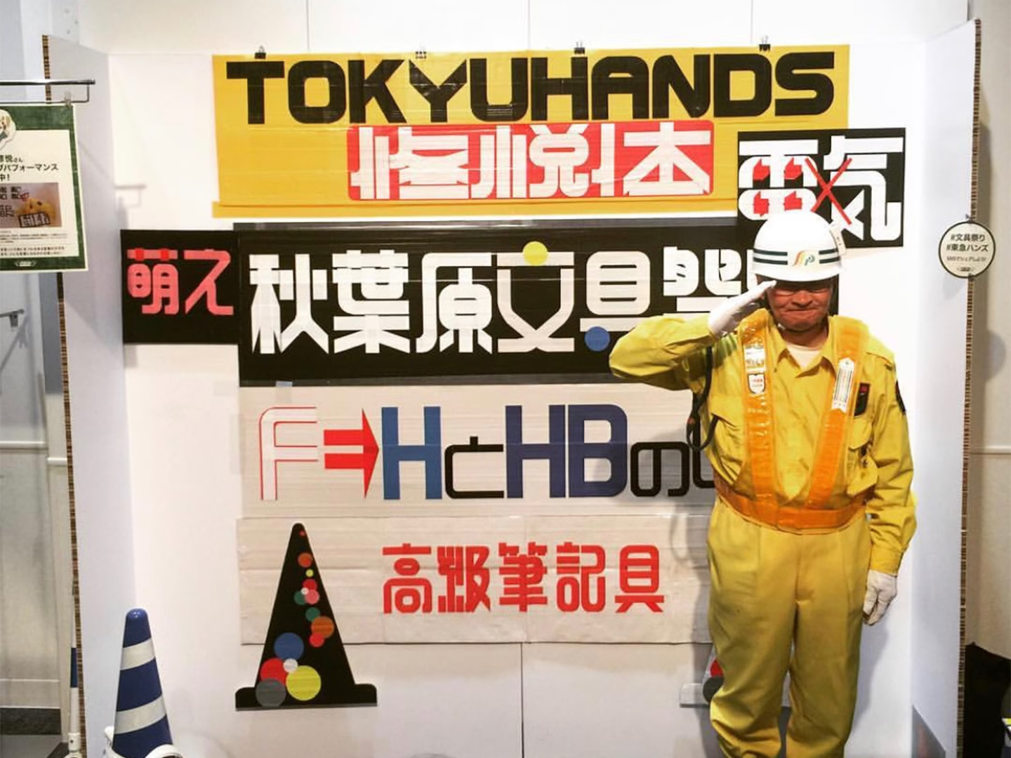
The material is central to the style. In English, Sato’s work is often described as duct tape lettering, but Japanese sources usually refer to cloth adhesive tape, a practical material for construction sites and temporary signage. It is strong, visible, inexpensive, and easy to apply to walls, boards, and barriers. Sato’s method is more controlled than the casual material suggests. He lays strips of tape close together, then cuts away the unnecessary parts with a cutter, almost carving letters out of a taped surface. That process gives Shuetsu-tai its distinctive look: bold and modular, but not mechanical. The cuts are precise, but the material keeps the work from becoming too polished. It feels closer to public-use lettering than display typography.
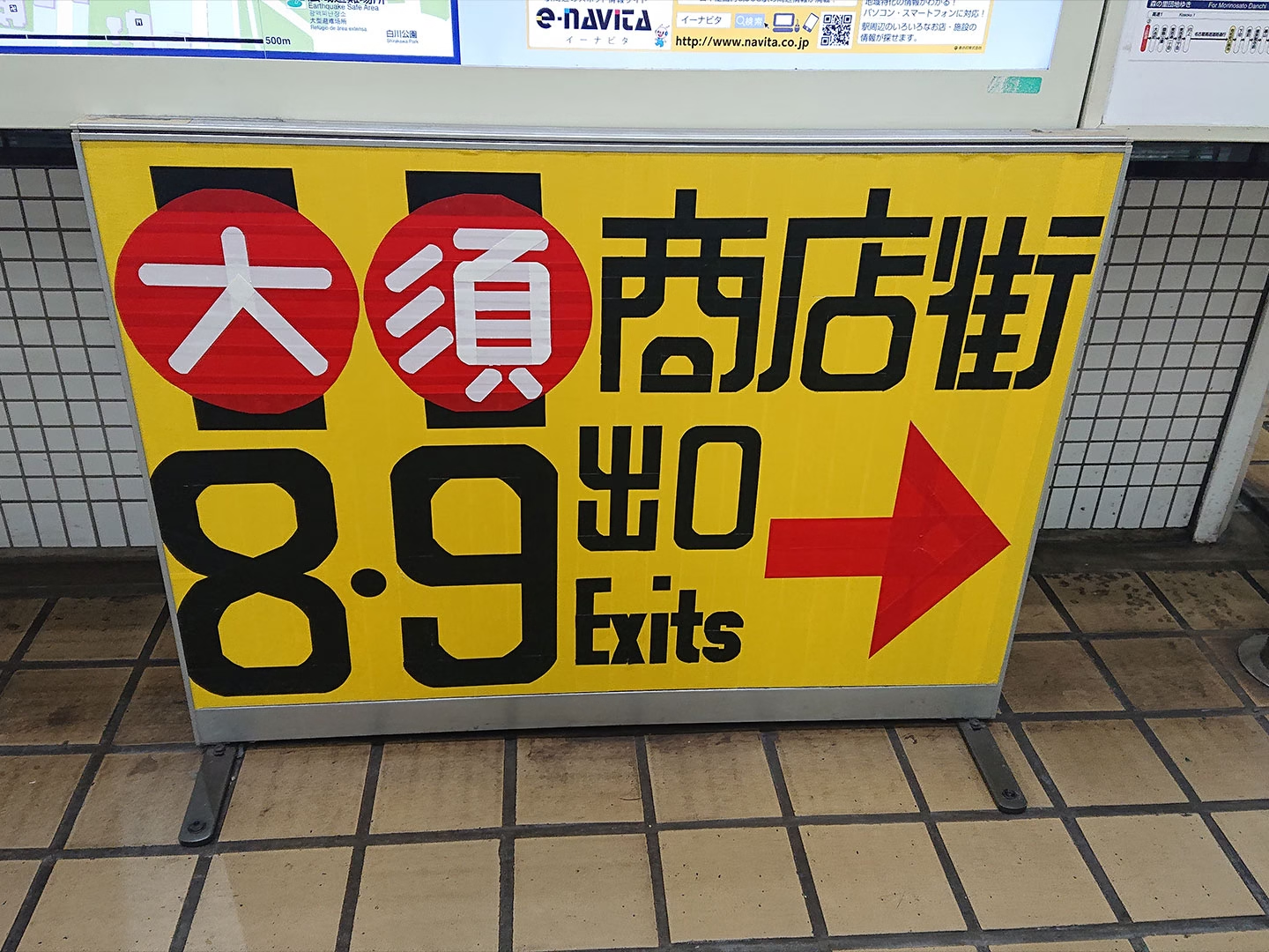
3. Rounded Lettering for Stressed Commuters
One of the defining features of Shuetsu-tai is its rounded treatment. In a station like Shinjuku, where construction can make an already crowded route feel more stressful, that softness becomes part of the message. The rounded edges help the signs feel less blunt, giving practical instructions a gentler tone. Sato’s signs did not only tell people where to go. They made the instruction feel less harsh, turning temporary wayfinding into something noticeably human.
4. Nike Shinjuku
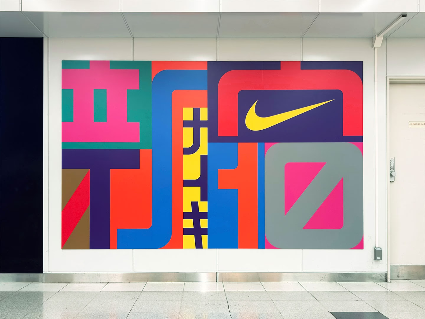
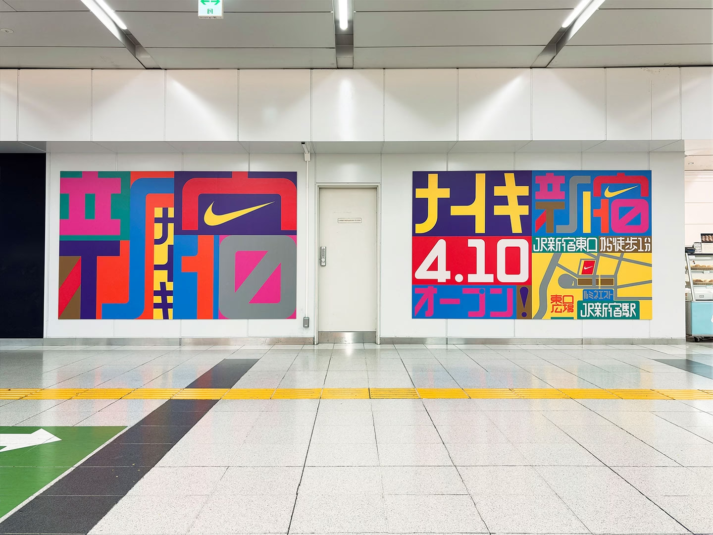
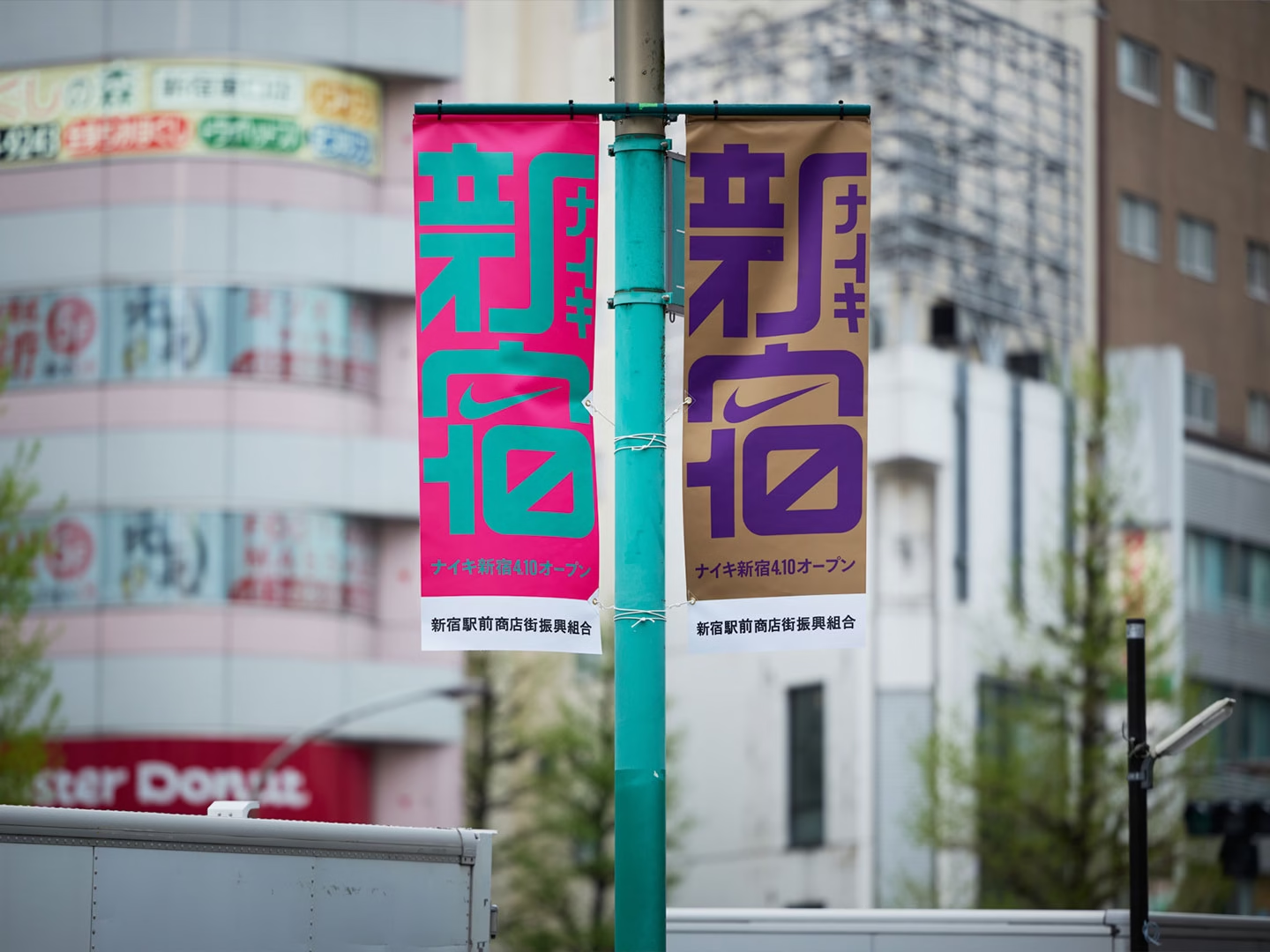
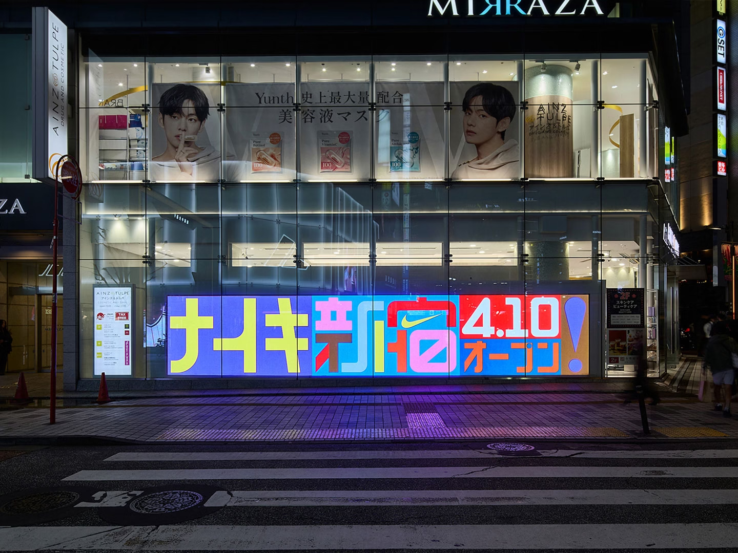
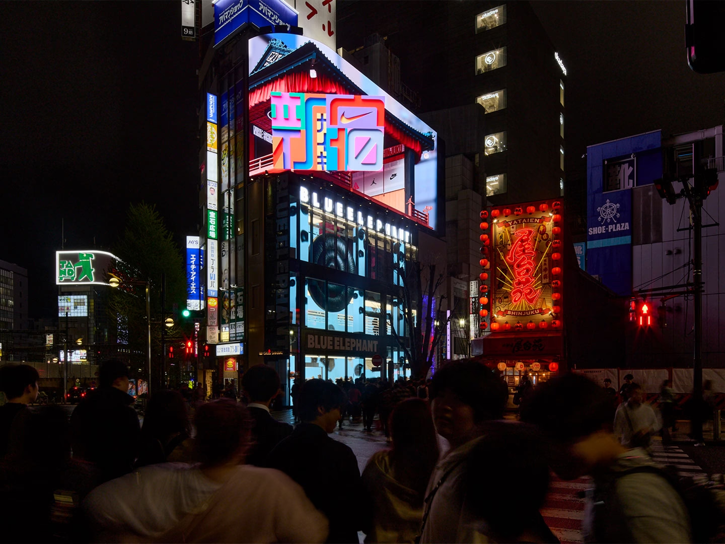
In 2026, Shuetsu-tai entered a more formal commercial context through Nike Shinjuku, a store opened near Shinjuku Station’s East Exit. Its visual identity included a collaboration between Sato and graphic designer Shun Sasaki, with a logo that needed to feel specific to Shinjuku while still belonging to Nike. That connection makes the project feel less arbitrary than a typical brand collaboration. Sato’s lettering was already tied to the area. It came from the station, the East Exit, and the movement of people through Shinjuku. By using Shuetsu-tai, Nike was not simply borrowing a handmade aesthetic. It was referencing a local visual language that many commuters already associated with the place. The logo also appeared across customizable elements such as Nike By You patches, turning a temporary wayfinding style into part of a retail identity.
5. Beyond the Station
Shuetsu-tai became graphic culture because it passed through several stages. First, it solved a real problem. Then people noticed the signs as more than instructions. They photographed them, shared them, and began to recognize the lettering as a style. Later, it appeared in workshops, media coverage, capsule toys, and brand collaborations. Public signage is usually meant to disappear into use. When it works, people follow it and move on. Sato’s signs did something slightly different. They worked as instructions, but they also carried personality. The tape, the cuts, the rounded letters, and the temporary surfaces all point back to a moment when a security guard tried to make a confusing station easier to understand. The signs were not designed to last, but their clarity and warmth gave them a longer life than the construction walls they were made for.