Playful, precise, and postmodern
In 1980s Japan, industrial company Wakita partnered with designer Shohei Mihara to produce a series of household clocks that broke from conventional design. Better known for shipbuilding materials and metalwork, Wakita shifted into consumer goods through this collaboration. The result was the Super Present series—a collection that replaced functional austerity with color, character, and visual rhythm. While initially niche, the clocks are now recognized as notable examples of Japanese postmodern design.
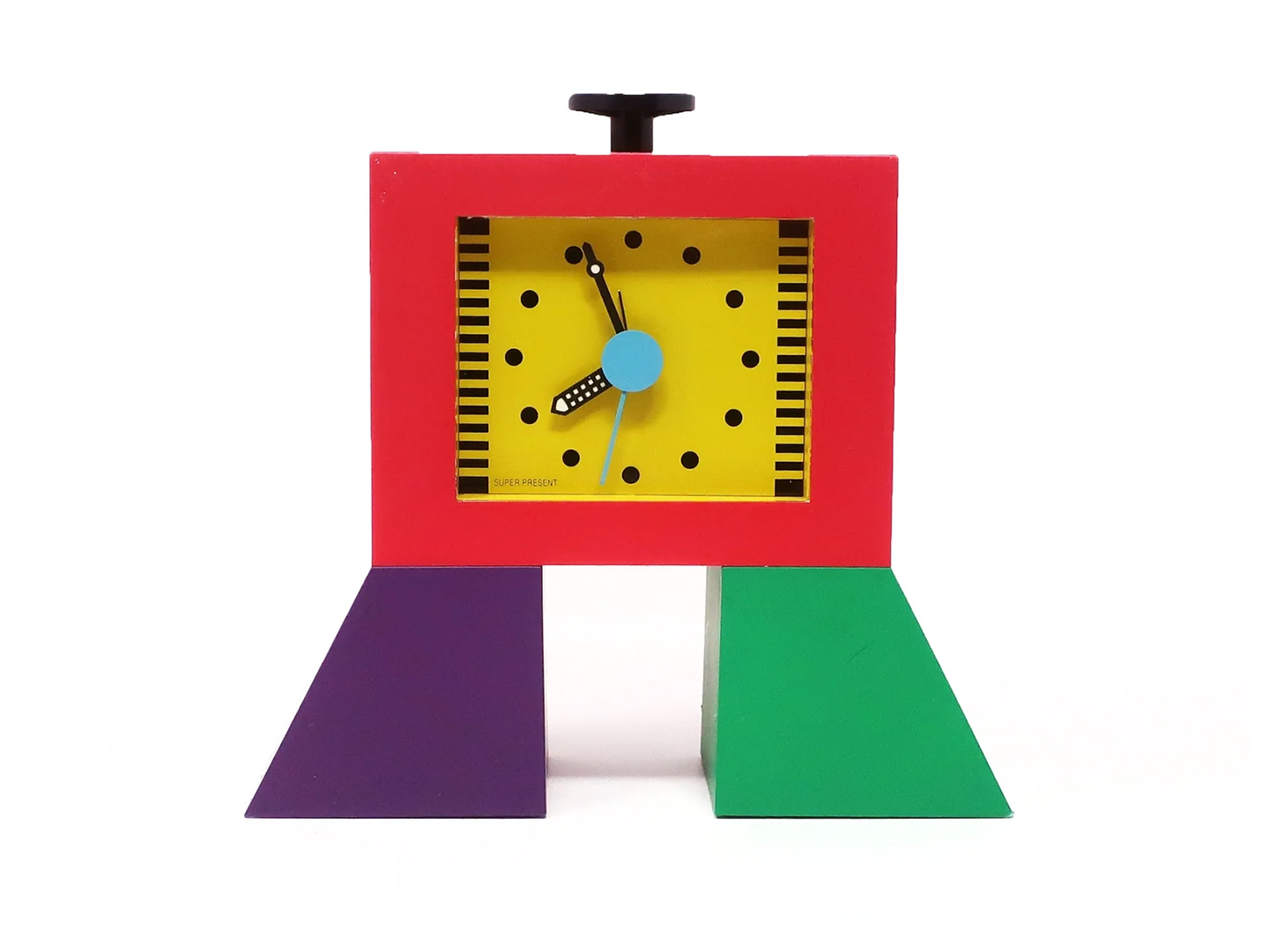
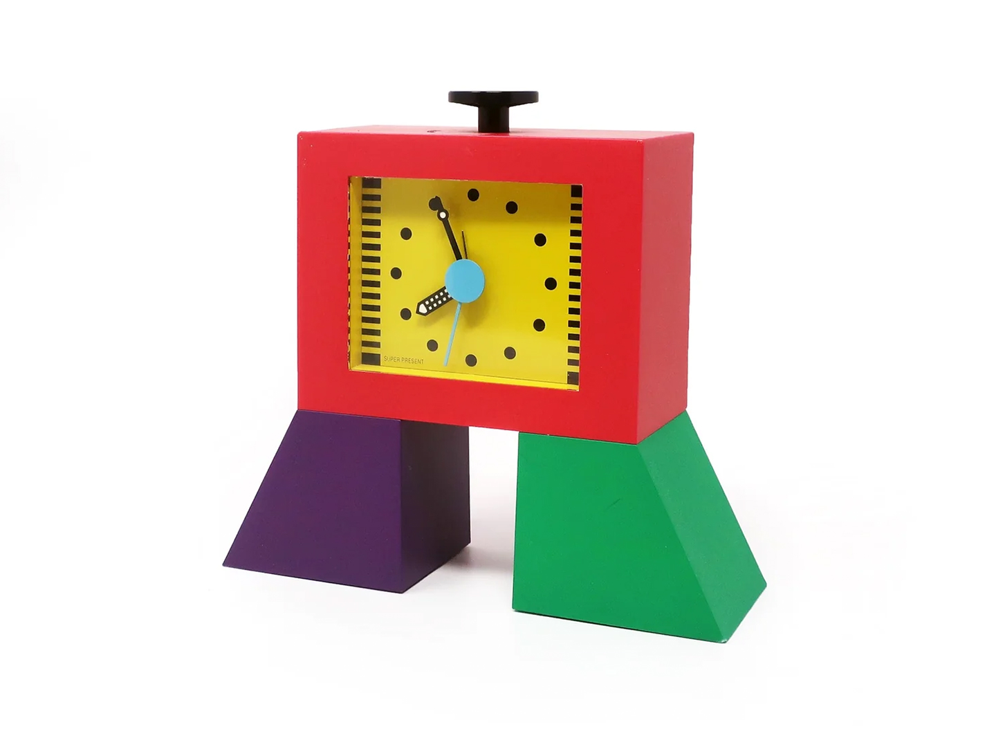
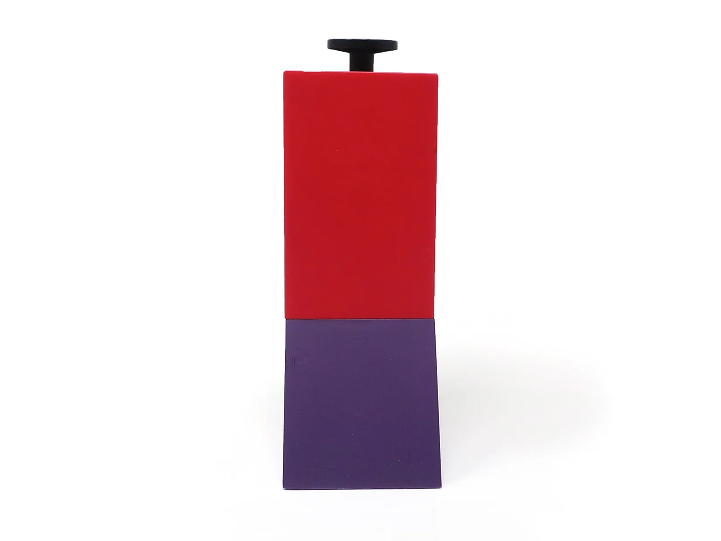
1. Paradise Alarm Clock
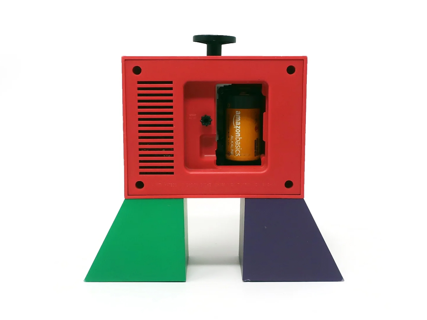
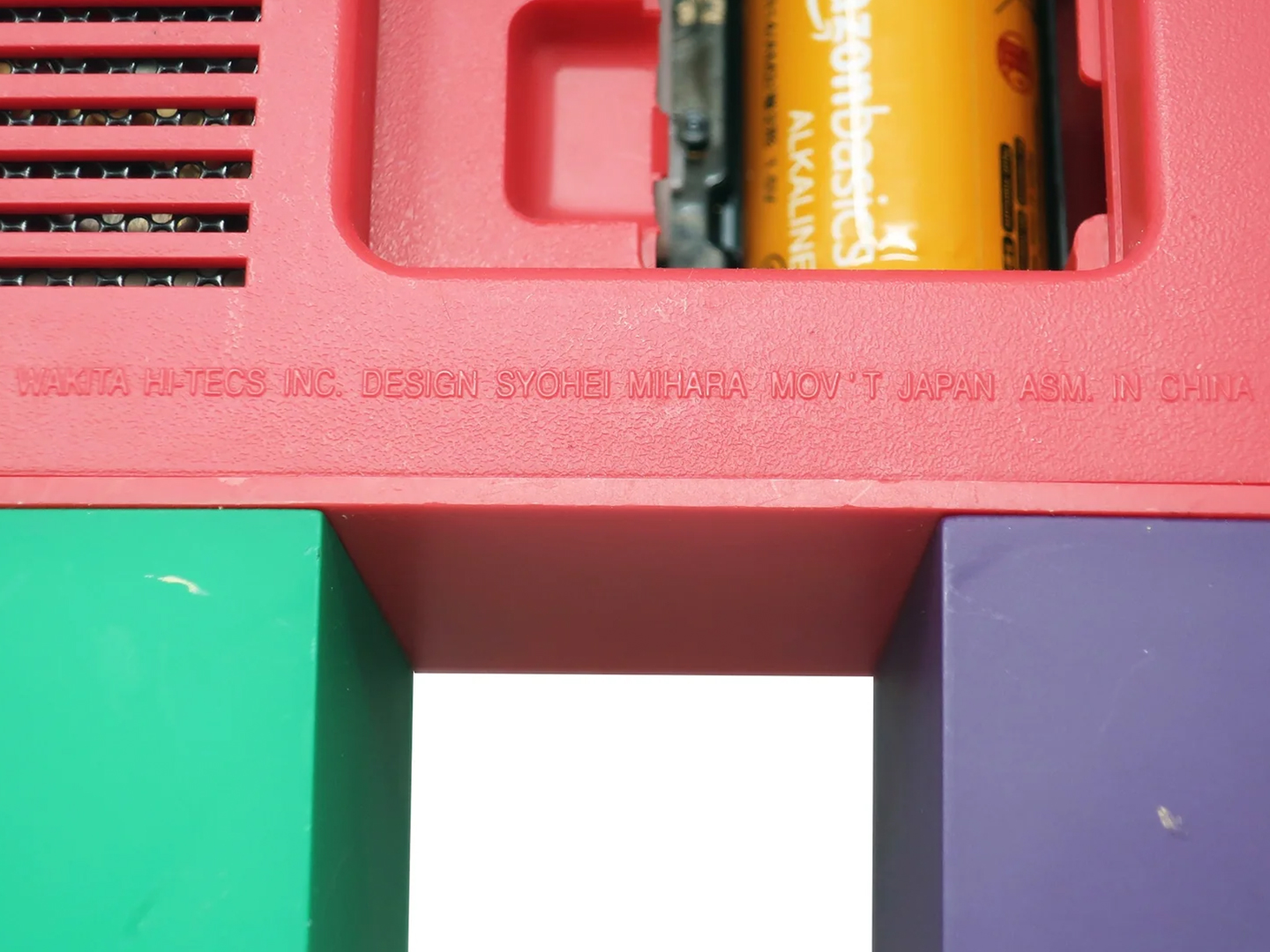
Released circa 1980, the Paradise alarm clock was among the earliest entries in the Super Present line. Constructed from injection-molded plastic, it features a red rectangular body, a yellow dial, and trapezoidal green and purple legs that tilt the form forward. The hour and minute hands are distinct in both shape and color, and a black dome on top functions as the alarm set button. The design reflects Mihara’s early use of asymmetry and color as defining design elements.
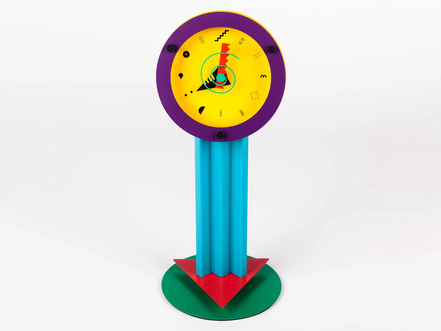
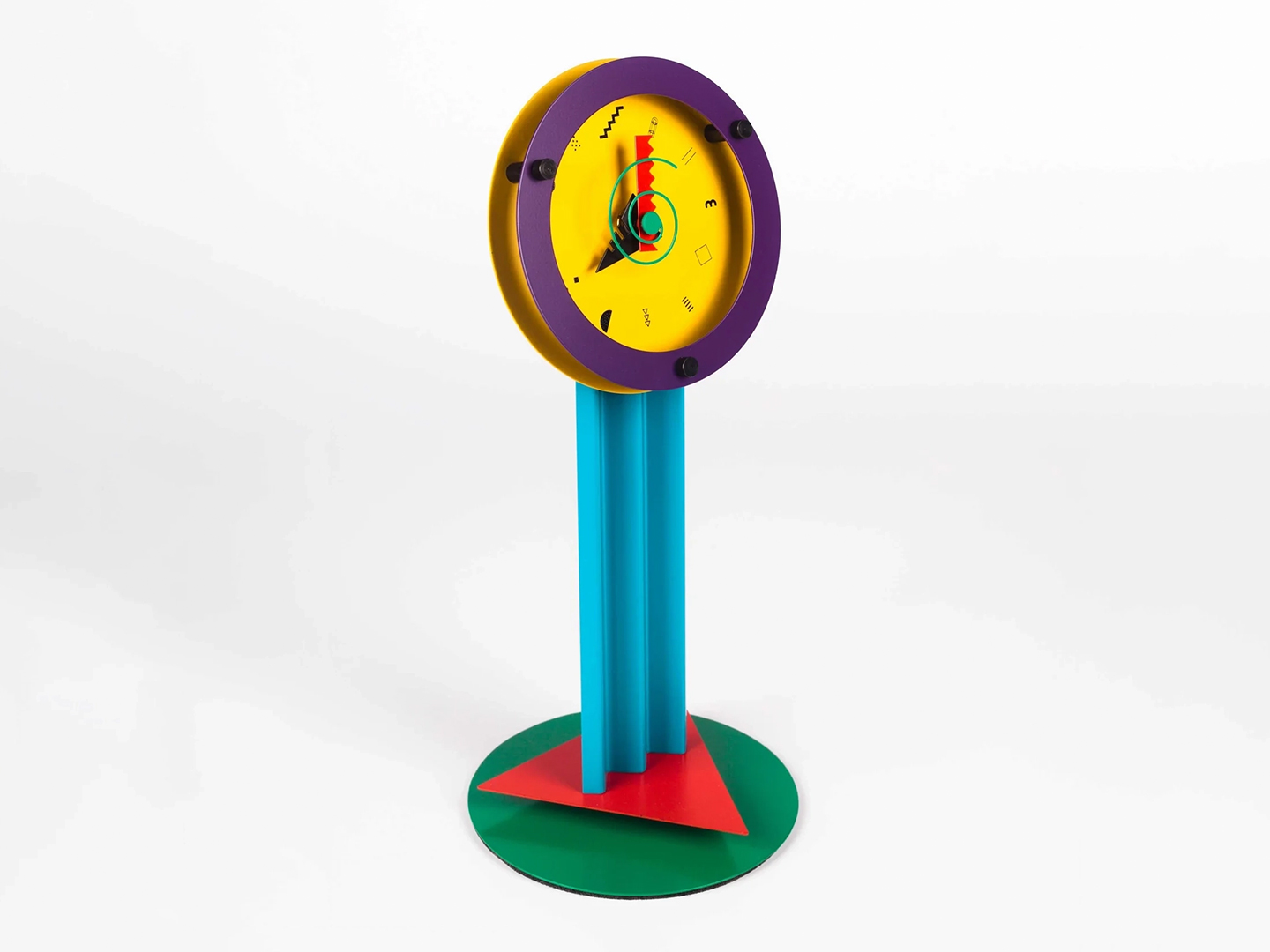

2. Paradise Desk Clock
The Paradise desk clock features a square plastic body with a round yellow dial and color-blocked components arranged in asymmetrical alignment. Each hour is marked by a symbolic graphic rather than a numeral, and the hands are uniquely shaped to emphasize motion over legibility. Compact and expressive, it was one of the most widely recognized designs in the series and helped establish the visual identity of the Super Present line.
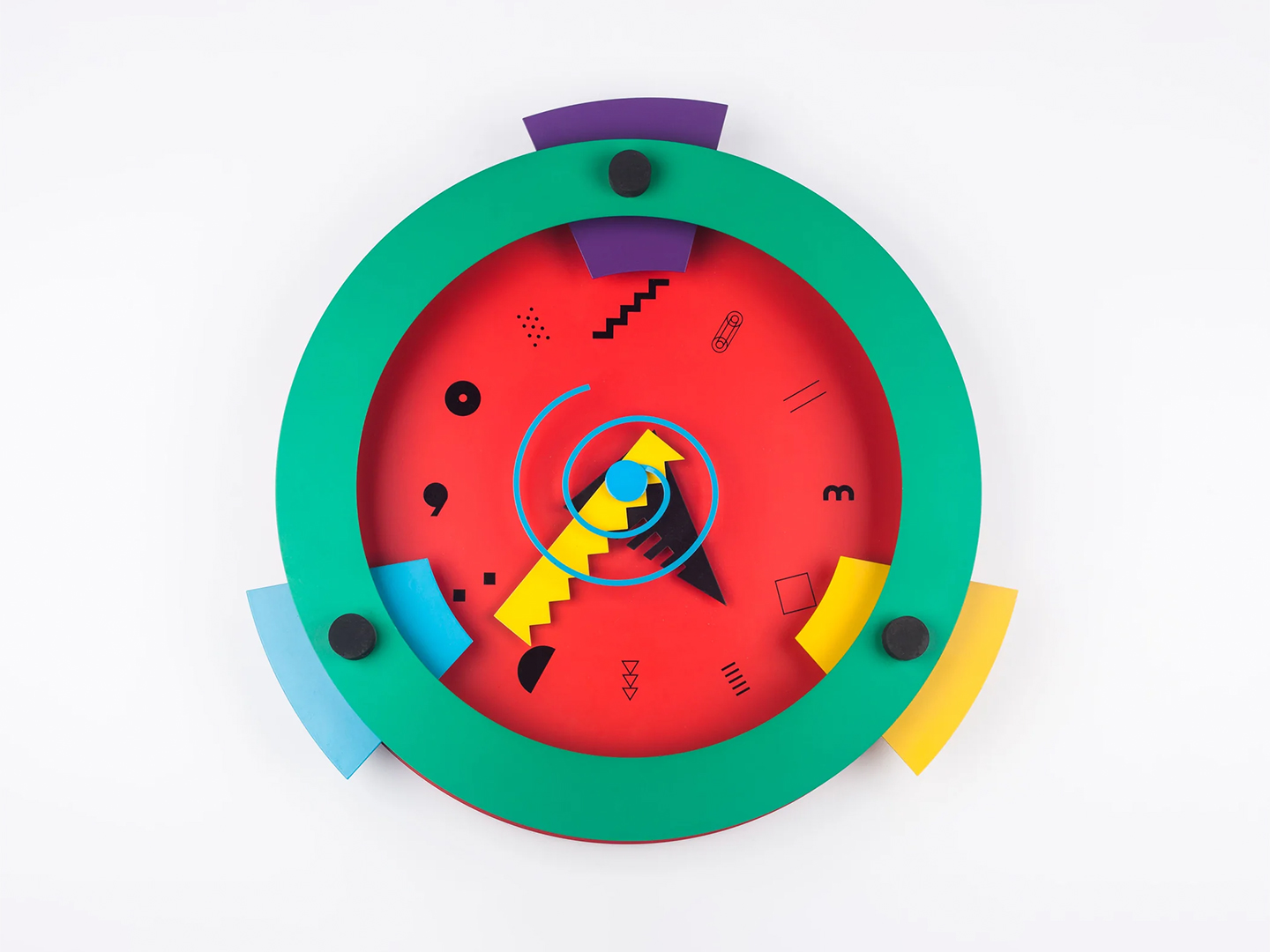
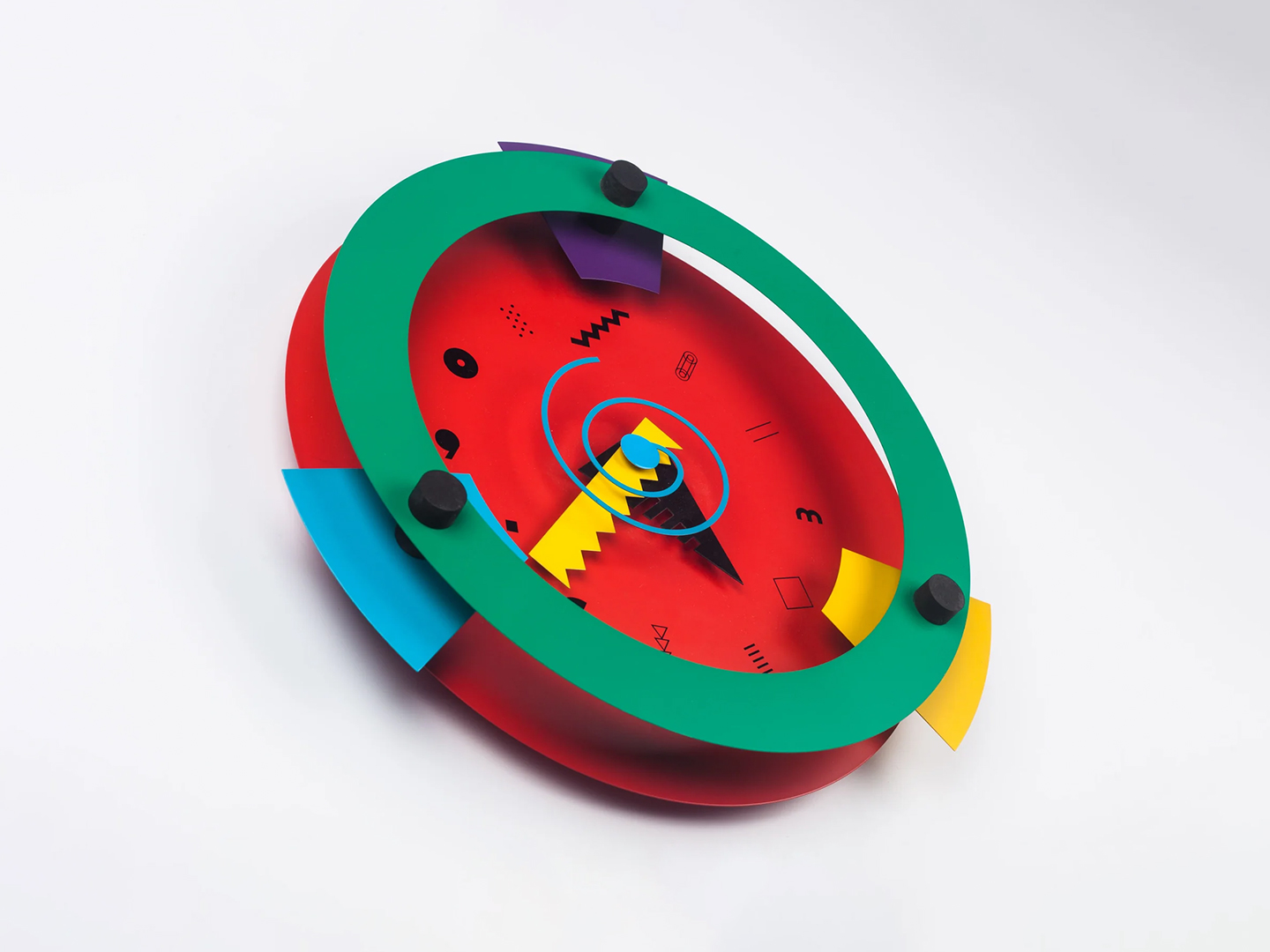

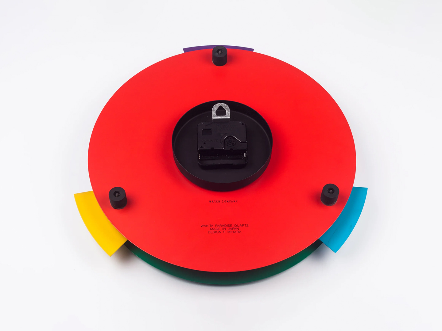
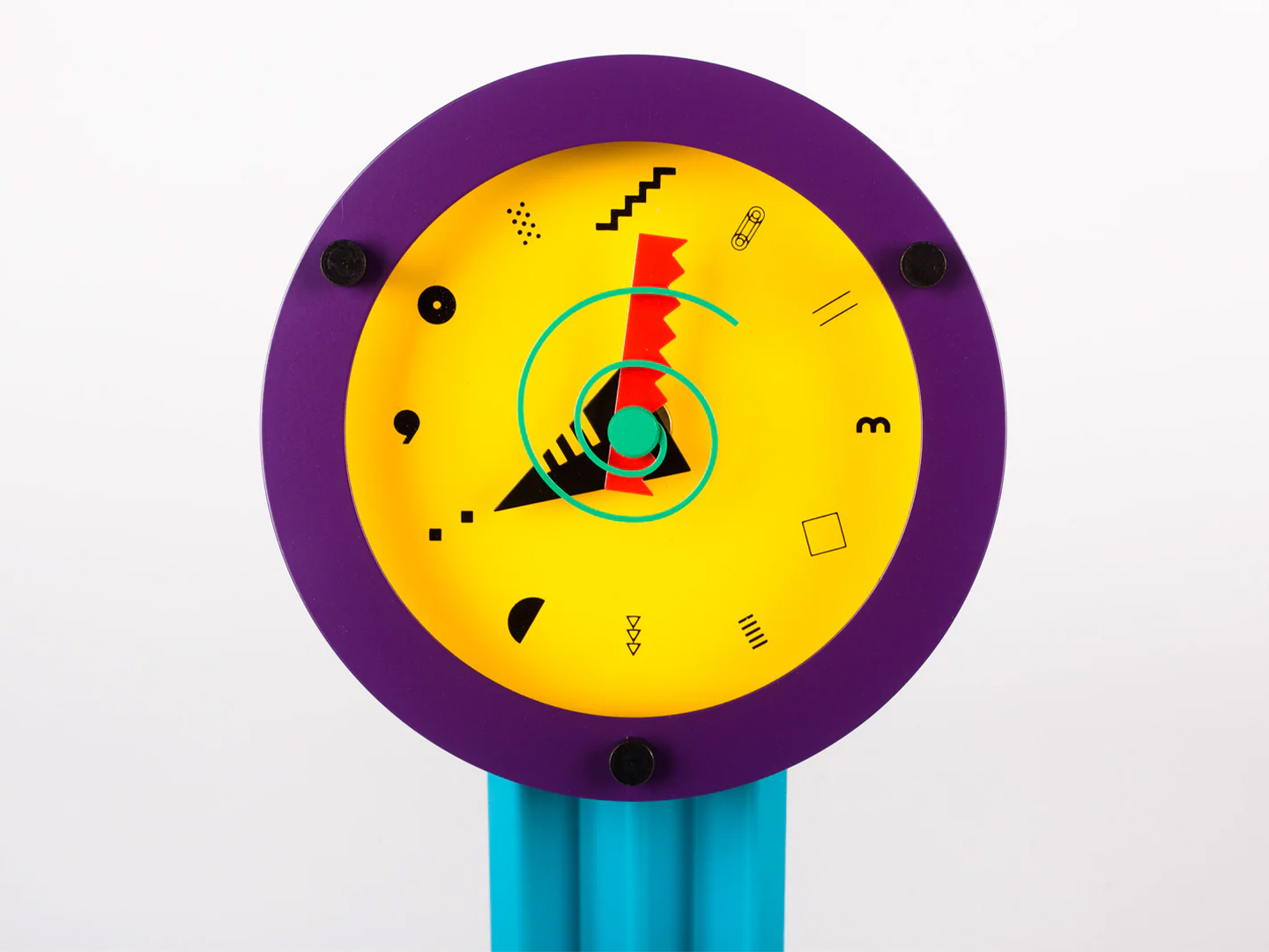
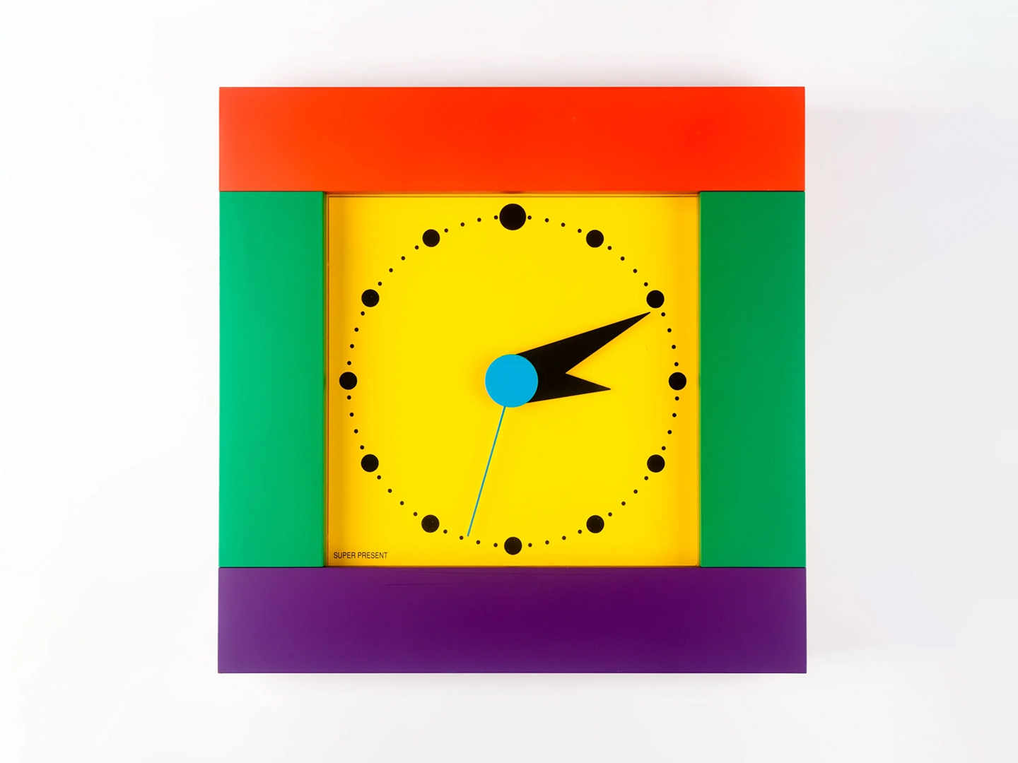
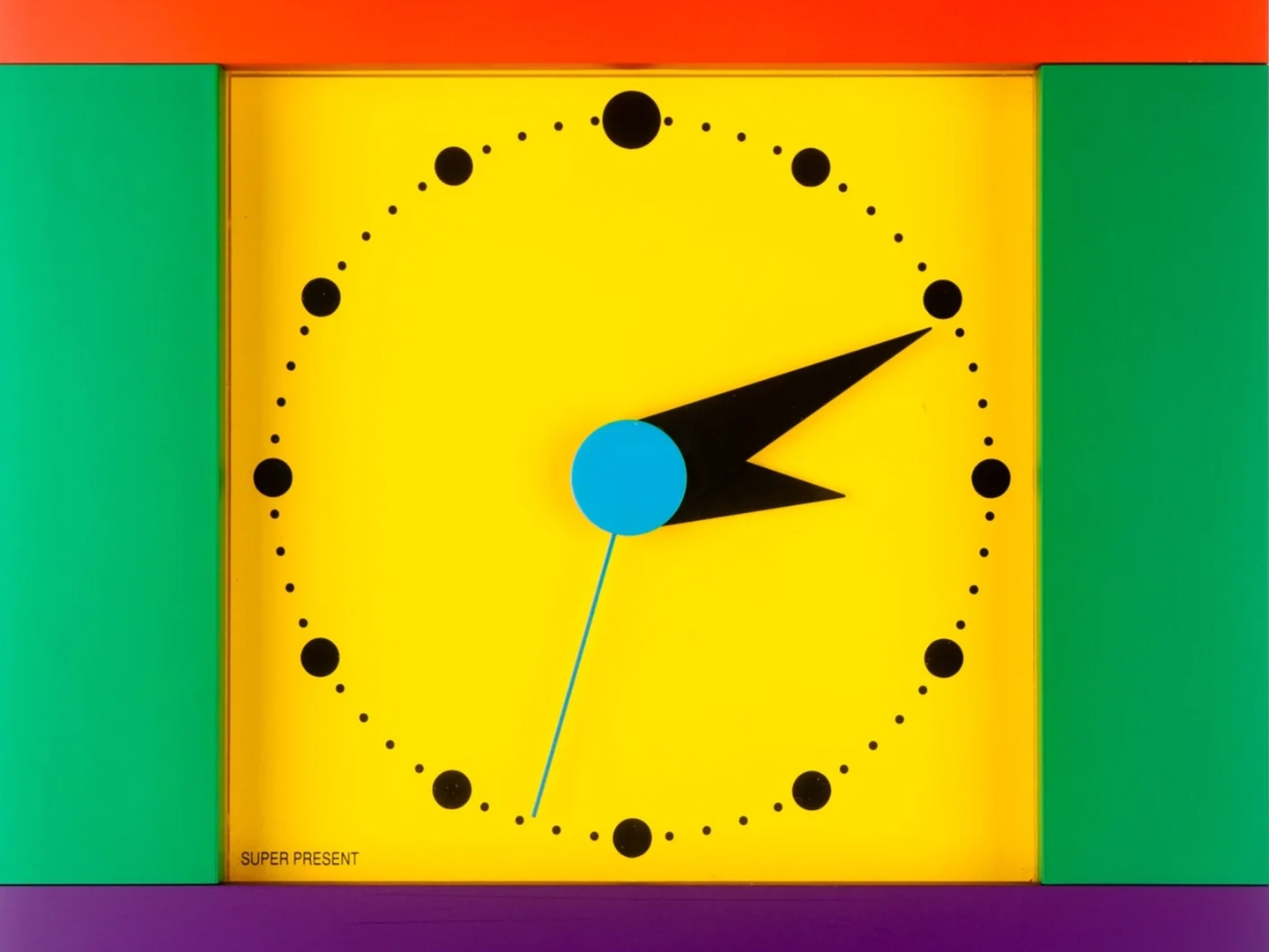
3. Paradise Wall Clock
Produced in the mid-1980s, the Paradise wall clock expanded on the visual language first introduced in the Paradise desk clock, applying its symbolic dial and layered color composition to a larger, wall-mounted format. Made from enameled steel, rubber, and plastic, it was one of the first Super Present models to be exported internationally. Some versions were distributed under foreign brand names such as Canetti. While unconventional for the Japanese market at the time, the design gained attention for its playful construction and abstract hour markers, and was later recognized as a reference point in Japanese postmodern design.
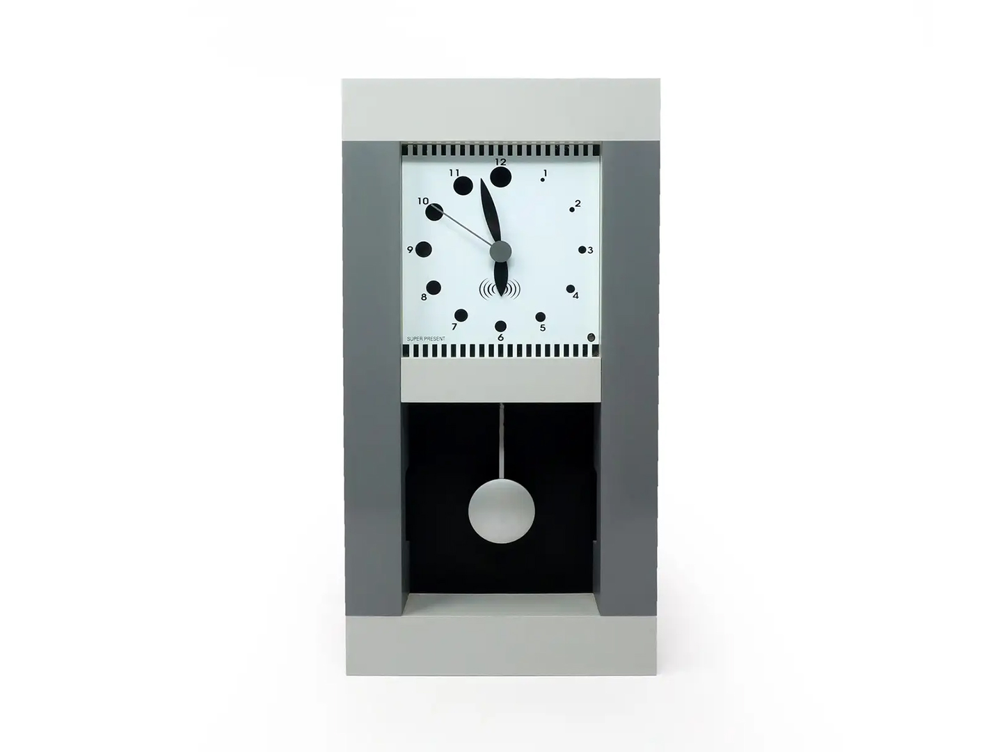
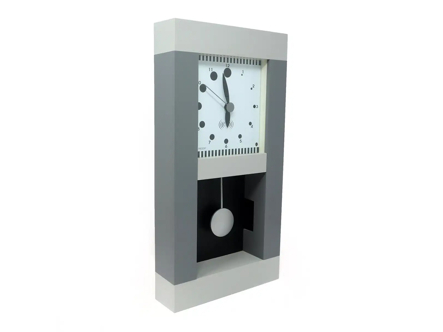
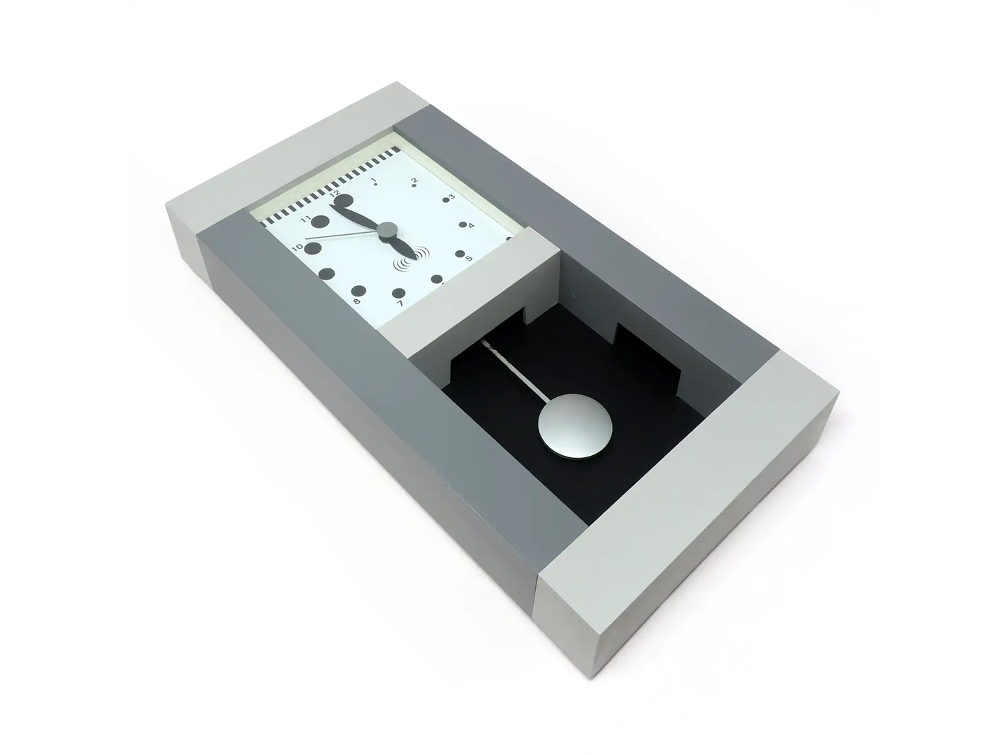

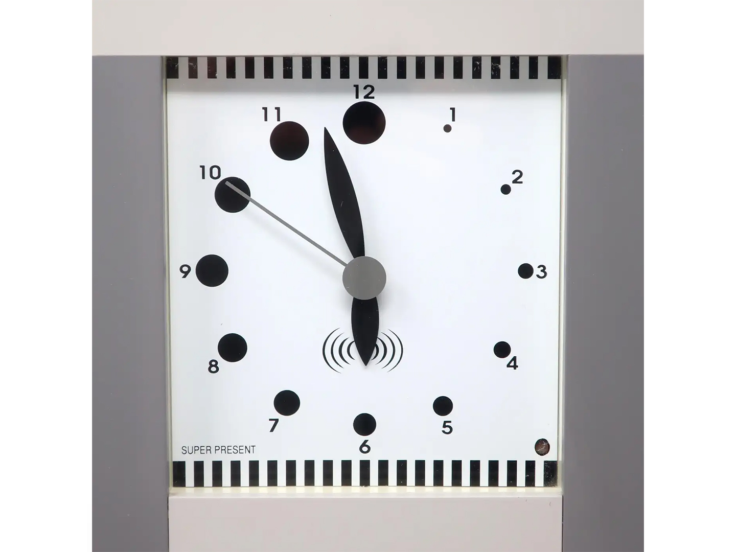
4. Pendulum Wall Clock
Developed as a more mechanical variation within the Super Present line, the pendulum wall clock combined quartz timekeeping with a swinging chrome pendulum. It included a light sensor that activated an hourly chime and automatically muted in the dark, a forward-looking feature at the time. Though the electronics proved delicate over time, the model stood out for combining classical pendulum mechanics with the graphic design language of 1980s consumer objects. It was later awarded a Good Design Award in Japan.

5. Square Wall Clock
Introduced in the early 1990s, this square wall clock reflected a more condensed, geometric approach to Mihara’s earlier design concepts. Manufactured in molded plastic and measuring roughly 25 cm across, it retained the Super Present line’s distinctive use of color and non-numerical dials. Compared to earlier models, the clock showed restraint in form while still carrying the visual wit of earlier designs, reflecting Mihara’s evolving balance between play and precision.